| Author | Thread |
|
|
02/07/2006 09:25:23 PM |
*** Critique Club ***
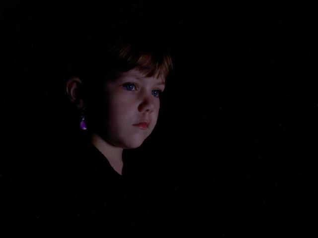
First impressions: This image seems to have a somber feel to it. This is probably due to the child's expression (intended or not)
Composition: The child is placed well in the frame with plenty of space for her to look into. Good use of negative space.
Exposure: Though I think you were going for a 'fade to black' look I feel the image a little underexposed. The skintone doesn't seem right. Good catchlight in the eyes.
Impact: The impact is gained from the child's expression and use of negative space.
Had I voted on this challenge I probably would have given it a 6.
Colette |
|
Comments Made During the Challenge  |
|
|
01/30/2006 11:20:47 PM |
| Nice use of single light source. However the image seems to lack a bit of contrast. In my bright monitor, it's already fairly dark and is evidenced in her face. Her look is stunning though and leads me to think what she was thinking about when you took this beautiful image. I'm sure this will be a keeper in your family for years to come. |
|
 Photographer found comment helpful. Photographer found comment helpful. |
|
|
01/27/2006 09:38:41 PM |
| Lovely low key rendition to honor Henson. Bumping up. |
|
| Photographer found comment helpful. |
|
|
01/27/2006 08:52:53 PM |
From an article on the net: simultaneously intimate and distant. In his world of shadows and suggestion, writes Peter Craven, a face is more than just a face.
You've captured that well here. |
|
| Photographer found comment helpful. |
|
|
01/27/2006 01:59:36 PM |
| Nice expression. Wish for more light - know you were trying to emulate the opera images, but it's just too dark. |
|
|
|
01/27/2006 12:59:17 PM |
| Beautiful but would have loved to see more light on her face. |
|
| Photographer found comment helpful. |
|
|
01/26/2006 09:22:36 AM |
| How telling. I like the use of a shold here. Such softness, yet the dark framing and backgorund sort of imparts a sense of deep maturity. |
|
| Photographer found comment helpful. |
|
|
01/26/2006 01:17:35 AM |
| The light behind the back - need to be more careful composing. |
|
|
|
01/25/2006 03:48:23 PM |
| Henson's look is less saturated and more highlighted. Nice image though.8 |
|
| Photographer found comment helpful. |
|
|
01/25/2006 02:09:39 PM |
| This is a little too dark for me. |
|
|
|
01/25/2006 04:27:27 AM |
| Good tribute - fits in the paris opera project very well. |
|
| Photographer found comment helpful. |
|
|
01/25/2006 03:54:19 AM |
| nice face and composition...lacks a little punch imho |
|
| Photographer found comment helpful. |
Home -
Challenges -
Community -
League -
Photos -
Cameras -
Lenses -
Learn -
Help -
Terms of Use -
Privacy -
Top ^
DPChallenge, and website content and design, Copyright © 2001-2025 Challenging Technologies, LLC.
All digital photo copyrights belong to the photographers and may not be used without permission.
Current Server Time: 03/12/2025 10:12:27 AM EDT.