| Author | Thread |
|
|
07/08/2002 02:23:00 AM |
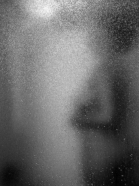
| I think I was as disapointed with this picture as most of you were,.... The thing I learned with this was, if you dont like the image that you took for the challenge then dont submit one. well any congrats to all the winners. |
|
Comments Made During the Challenge  |
|
|
07/07/2002 10:46:00 PM |
| nice idea! black and white works very good here. good interpretation of "transparency" also. |
|
|
|
07/07/2002 09:33:00 AM |
| Is this through a shower door? This is a neat idea but the apparent light reflection at upper left is a distraction. |
|
|
|
07/05/2002 03:16:00 PM |
The thumbnail of this really had some potential, but when I clicked on it, and it enlarged, I found it difficult to see what you where doing. A shower door, maybe?
karmat |
|
|
|
07/04/2002 09:44:00 PM |
| Don't know what I'm looking at ... sjgleah |
|
|
|
07/03/2002 02:58:00 AM |
|
|
|
07/03/2002 12:21:00 AM |
| Very interesting design. I like it. |
|
|
|
07/02/2002 08:43:00 PM |
|
|
|
07/02/2002 04:44:00 PM |
| I really like the concept on this photo. I am not sure if I like it in black and white or not. I would be curious to see the difference between this and the color image... = 6 - jmsetzler |
|
|
|
07/02/2002 04:19:00 PM |
| You can tell better what this is when it's a thumbnail. Nice job though. |
|
|
|
07/02/2002 07:28:00 AM |
| Very subtle and though provoking. The black and white works well. |
|
|
|
07/01/2002 06:32:00 PM |
| As soon as I saw the title I started looking for a naked woman in there. After a while I got it. Very good! |
|
|
|
07/01/2002 06:21:00 PM |
|
|
|
07/01/2002 03:15:00 PM |
| good color ballance. taking a risk is good. |
|
|
|
07/01/2002 02:59:00 PM |
| please tell me thats an adult... |
|
|
|
07/01/2002 02:26:00 PM |
| Almost too subtle (remember our audience). A bit bland of a shot. Photo 7 Transparency 6 total 6 swash |
|
|
|
07/01/2002 12:46:00 PM |
|
|
|
07/01/2002 11:37:00 AM |
| this is interesting but might be too abstract. |
|
|
|
07/01/2002 11:24:00 AM |
| the mist obscured the figure a bit too much. I didn't notice it, until I was reviewing my scores. Thought I hadn't seen the picture. Now that I understand it, I like it better. |
|
|
|
07/01/2002 01:34:00 AM |
| This reminds me of my shadow entry. Hope yours does better than mine did. I like the texture. My only complaint is the bright spot in the top left. |
|
Home -
Challenges -
Community -
League -
Photos -
Cameras -
Lenses -
Learn -
Help -
Terms of Use -
Privacy -
Top ^
DPChallenge, and website content and design, Copyright © 2001-2025 Challenging Technologies, LLC.
All digital photo copyrights belong to the photographers and may not be used without permission.
Current Server Time: 03/13/2025 12:40:22 AM EDT.