| Author | Thread |
Comments Made During the Challenge  |
|
|
01/31/2006 10:10:51 AM |
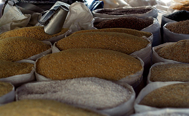
| I like the DOF you used as well as the lighting. |
|
 Photographer found comment helpful. Photographer found comment helpful. |
|
|
01/29/2006 12:31:20 PM |
| A greater DOF would have made this image stronger. I think an adjustment in colors is called for this image. As it is right now, there is nothing that holds my attention and pay particular interest to this image. Sounds harsh but I believe it's the reality of this photo. Sorry but no harm intended here. Just improvement :) |
|
| Photographer found comment helpful. |
|
|
01/26/2006 08:51:53 PM |
| I'm not sure to whose work this is a tribute, but that's OK. It seems as though the focus is on the silver pitcher to the upper left - I'd have preferred a bit less shallow DOF, to get the grain in the center more in focus. |
|
| Photographer found comment helpful. |
|
|
01/25/2006 01:47:41 PM |
| Who is this a tribute to? |
|
| Photographer found comment helpful. |
|
|
01/25/2006 12:47:26 PM |
| Part of the fun of the challenge is comparing the photos to the work of the photographers they're paying tribute to. I can't figure out who that would be in this case. This subject has been photographed many many times. To compare well with the genre, I would suggest brightening the image somewhat, increasing the saturation, and greater DOF. These may not have been your intent but they are my preferences. |
|
| Photographer found comment helpful. |
|
|
01/25/2006 01:53:12 AM |
| not sure who the tribute is to and the shot looks a little flat |
|
| Photographer found comment helpful. |
Home -
Challenges -
Community -
League -
Photos -
Cameras -
Lenses -
Learn -
Help -
Terms of Use -
Privacy -
Top ^
DPChallenge, and website content and design, Copyright © 2001-2025 Challenging Technologies, LLC.
All digital photo copyrights belong to the photographers and may not be used without permission.
Current Server Time: 03/12/2025 08:12:34 AM EDT.