DPChallenge: A Digital Photography Contest You are not logged in. (log in or register
 
Challenge Entries
Portfolio Images
This image is not part of a public portfolio.
Feeling.......
Feeling.......
missinseattle


Photograph Information Photographer's Comments
Challenge: Blue II (Basic Editing III)
Camera: Olympus E-500 EVOLT
Lens: Olympus 40-150mm f/3.5-4.5 Zuiko Digital
Location: dining room window
Date: Jan 26, 2006
Aperture: F3.9
ISO: 100
Shutter: 1/25seec
Date Uploaded: Jan 28, 2006

Adjusted hue and saturation, sharpened.

Statistics
Place: 226 out of 446
Avg (all users): 5.0378
Avg (commenters): 6.5000
Avg (participants): 5.0085
Avg (non-participants): 5.0661
Views since voting: 846
Views during voting: 304
Votes: 238
Comments: 6
Favorites: 0


Please log in or register to add your comments!

AuthorThread
02/24/2006 02:08:26 PM
I like the mood you achive in this picture. Composition is dynamic and DOF in nice. IMO you could improve it without the background and with a darker table (it's a bit distracting).
  Photographer found comment helpful.
02/08/2006 07:59:12 PM
I didn't vote in this challenge however I probably would have scored it a 5 or a 6. I like the colors and the image as a whole is very pleasing and easy on the eyes.

As macrothing mentioned the sharpening could be improved. Also the sculpture thing I really don't get. I understand it's blue but the fact that it takes up so much real estate and not provide any meaning beyond it's color I think was a problem for you. If I was to reshoot this I think I would remove the sculpture and also possibly get the background more in focus since it looks like it could enhance the photo and theme further. Really there isn't much separating this photo from a much better score. Anyway, those are my thoughts.
  Photographer found comment helpful.
02/08/2006 07:19:41 AM
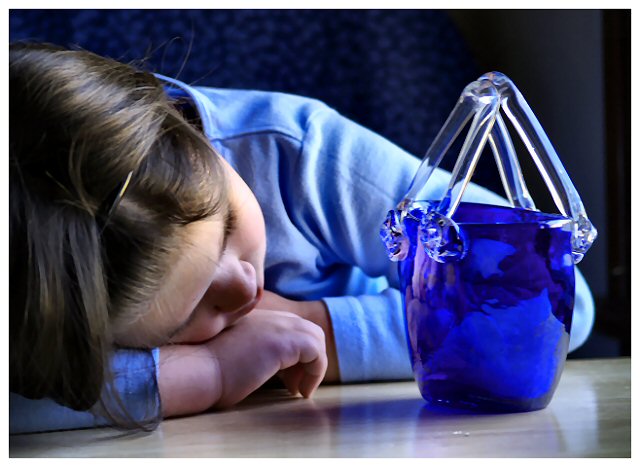
I gave this a 5. I thought the concept was 'ok' but .. the 'blue', sad, etc.. is not my taste/style, so I am likely not the best to provide feedback. Having said that, this Challenge of course opened up the perfect opportunity for such shots and therefore was 'acceptable', if that makes sense, and I think you captured that 'sense' fairly well. Quality wise it looks like it could be sharper, but it might be resizing issues, not sure. Perhaps a variation in perspective/angle, a different reflective surface used, more attention paid to 'composition'/subject placement and a more finely tuned crop, may have made this better in my opinion. Perhaps also 'using' the glass transparency more into your shot may have added another element as well. Sure isn't "rotten" in my opinion.
  Photographer found comment helpful.
 Comments Made During the Challenge
02/03/2006 09:18:04 PM
nice concept applied, voted !
  Photographer found comment helpful.
02/03/2006 03:16:11 PM
Great emotional shot....
  Photographer found comment helpful.
02/01/2006 02:53:29 PM
clear, nice!
  Photographer found comment helpful.


Home - Challenges - Community - League - Photos - Cameras - Lenses - Learn - Help - Terms of Use - Privacy - Top ^
DPChallenge, and website content and design, Copyright © 2001-2025 Challenging Technologies, LLC.
All digital photo copyrights belong to the photographers and may not be used without permission.
Current Server Time: 03/14/2025 01:24:06 AM EDT.