| Author | Thread |
|
|
02/08/2006 04:01:13 PM |
That's not Blue! That's CYAN. Didn't the DMNC nazis tell you that?
j/k ;) |
|
 Photographer found comment helpful. Photographer found comment helpful. |
|
|
02/08/2006 07:36:28 AM |
Greetings from the Critique Club!
..What are the odds of getting photos from same uses in consecutive days? :) Anyway, here I am ..doing critique for you again.
Aesthetic: Its a pleasing picture. Blue is soft and "smoke" (?) looks good. But the subject is not very "interesting" to me.
Technical: Seems to be well exposed. I feel deeper depth of field would have been much better.
Challenge: Fit the challenge. Period.
Conclusion: Overall an average composition. The subject is not very interesting. In such cases quality of composition or angle of capture really need to be "exclusive" to make it "impactful" picture. User use of different shade of blue, from regulars, has added a lot to the photo. Also focus also lacs sharpness but you still have a picture which can be worked upon in Photoshop.
I normally add my standard ending text, but since I have already done critique for you .. I'll skip it this time :)
Wish you a great day!
-Tej |
|
| Photographer found comment helpful. |
Comments Made During the Challenge  |
|
|
02/07/2006 11:32:41 PM |
| A very nice subject. personally i would have used a midnight blue here to let the metal sing. |
|
| Photographer found comment helpful. |
|
|
02/07/2006 08:13:33 AM |
| Wow, neat idea! It almost looks a bit eerie too. Good imagination and title. |
|
| Photographer found comment helpful. |
|
|
02/05/2006 09:15:56 PM |
| lovely study here...nice shot...hope this does well for you |
|
| Photographer found comment helpful. |
|
|
02/03/2006 07:10:47 PM |
|
| Photographer found comment helpful. |
|
|
02/02/2006 12:05:09 PM |
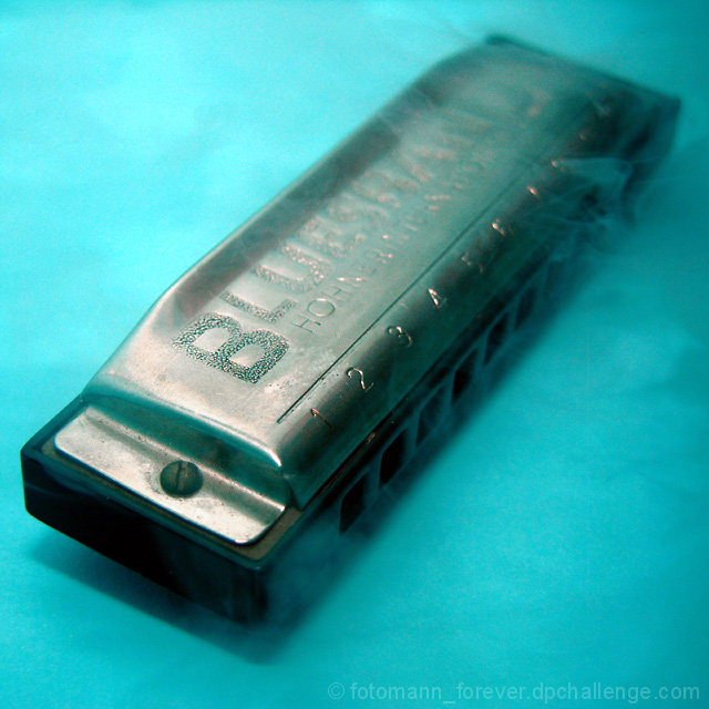
| nice texture on the harmonica, but since it is a blues instrument the blue background could have been done without. And the smoke does not add to the tone at all. |
|
| Photographer found comment helpful. |
|
|
02/02/2006 09:05:44 AM |
| It doesn't say anything to me. |
|
| Photographer found comment helpful. |
|
|
02/01/2006 10:03:48 PM |
| Is that a harmonica? If so, took me a while to figure it out, and very cool concept. But, concept seems to have been executed in a way that's a bit too subtle. |
|
| Photographer found comment helpful. |
|
|
02/01/2006 03:06:39 AM |
|
| Photographer found comment helpful. |
|
|
02/01/2006 01:01:46 AM |
| Good to see someone use a different shade of blue...seeing all the same blues was sending me into a blue mood....love the smoke...how did you do it? |
|
| Photographer found comment helpful. |
Home -
Challenges -
Community -
League -
Photos -
Cameras -
Lenses -
Learn -
Help -
Terms of Use -
Privacy -
Top ^
DPChallenge, and website content and design, Copyright © 2001-2025 Challenging Technologies, LLC.
All digital photo copyrights belong to the photographers and may not be used without permission.
Current Server Time: 03/14/2025 12:00:00 PM EDT.