| Author | Thread |
|
|
07/28/2003 12:15:21 AM |
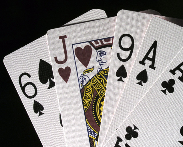
I tried to juice up the colors but there's some red reflecting off the backs of the cards which made it impossible without spot editing. (it may be possible but I don' know photoshop THAT well)
I put up a print that's a wider format (it can be cut down) and spot edited to really bring out the red
Message edited by author 2003-07-28 00:16:40. |
|
Comments Made During the Challenge  |
|
|
07/26/2003 02:57:31 PM |
| What a nifty idea! Lighting is perfect! 9 |
|
 Photographer found comment helpful. Photographer found comment helpful. |
|
|
07/24/2003 03:15:12 AM |
|
|
|
07/23/2003 02:35:43 PM |
| I do like the sharpness(that i can see the texture of the cards), composition and it meets the challenge topic. So technically I think is good. But it is very low in interest, there is nothing that makes me want to 'keep looking' at your photo. I think you have a lot of tecnical skill, maybe need a more interesting subject |
|
| Photographer found comment helpful. |
|
|
07/22/2003 04:06:31 AM |
| Excellent detail and lighting. A wonderful pic in every aspect - 10. |
|
| Photographer found comment helpful. |
|
|
07/21/2003 11:49:07 PM |
| Should have definately made the Jack level with the horizon. That would give it more "power" I think. And also use other cards beside the Aces. In my mind, the Aces compete with the Jack. Use 3's, 5's, 4's, etc. Good shot anway. |
|
| Photographer found comment helpful. |
|
|
07/21/2003 11:22:23 PM |
| nice macro, great detail... |
|
| Photographer found comment helpful. |
|
|
07/21/2003 10:00:03 PM |
| Great idea and composition! I just wish the red were a little brighter to emphasize the color. |
|
| Photographer found comment helpful. |
|
|
07/21/2003 01:39:08 PM |
| You might have juiced the saturation of the reds a little better to make the Jack stand out a little more, but it's a great crisp image, and a nice concept. |
|
| Photographer found comment helpful. |
|
|
07/21/2003 11:45:51 AM |
| Super nice focus...killer lens- and nice lighting. |
|
| Photographer found comment helpful. |
|
|
07/21/2003 08:44:14 AM |
| Nice job... The reds seem to be a tad desaturated though? |
|
| Photographer found comment helpful. |
|
|
07/21/2003 03:43:38 AM |
| Looked at this for ages... thinking (s)he should have used a red card.. Then I see that a heart is a red card.. but it looks grey.. Is it black and white? No, the yellow is still there.. In short.. good idea.. think you should have made the card redder..7 |
|
| Photographer found comment helpful. |
Home -
Challenges -
Community -
League -
Photos -
Cameras -
Lenses -
Learn -
Help -
Terms of Use -
Privacy -
Top ^
DPChallenge, and website content and design, Copyright © 2001-2025 Challenging Technologies, LLC.
All digital photo copyrights belong to the photographers and may not be used without permission.
Current Server Time: 03/13/2025 07:40:24 AM EDT.