| Author | Thread |
Comments Made During the Challenge  |
|
|
02/07/2006 07:14:06 PM |
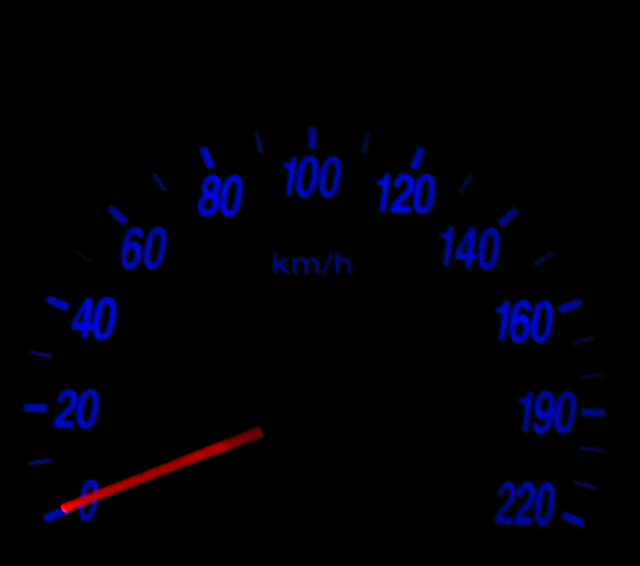
| nice colour wheel opposite colours that attract but feel the overall focus is lacking |
|
|
|
02/07/2006 02:14:17 PM |
Nice contrast of red versus blue.
A bit more focus would be good but I suspect lighting was a tiny issue here :-)
Nice shot! |
|
|
|
02/07/2006 09:04:37 AM |
|
|
|
02/07/2006 07:28:20 AM |
| needs better focus maybee. |
|
|
|
02/06/2006 11:06:30 PM |
| A good idea. I think this would have worked better if the numbers had been sharper and the colour more punch. |
|
|
|
02/03/2006 08:41:07 PM |
| I like the concept, but it would more interesting if the needle was around 120 or above. |
|
|
|
02/02/2006 11:51:46 PM |
|
|
|
02/02/2006 10:13:48 PM |
|
|
|
02/01/2006 05:09:58 PM |
| This is one I didnt expect, I actually really like it. 8 |
|
|
|
02/01/2006 03:14:04 PM |
| Good thing the needle is not on 220! |
|
Home -
Challenges -
Community -
League -
Photos -
Cameras -
Lenses -
Learn -
Help -
Terms of Use -
Privacy -
Top ^
DPChallenge, and website content and design, Copyright © 2001-2025 Challenging Technologies, LLC.
All digital photo copyrights belong to the photographers and may not be used without permission.
Current Server Time: 03/14/2025 09:30:45 AM EDT.