| Author | Thread |
Comments Made During the Challenge  |
|
|
07/07/2002 03:36:00 PM |
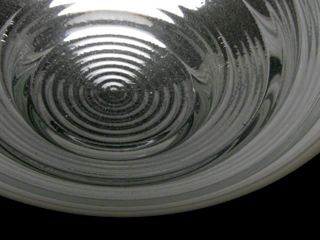
| Good abstract of a light cover. Nicely done. |
|
|
|
07/06/2002 02:42:00 PM |
| I think maybe color would have worked here because in black and white, it almost looks like a reflection instead of a transparent something or other. With color, you may have been able to distinguish top/bottom, etc. I like the way it is framed, and the use of the empty space at the bottom. karmat |
|
|
|
07/05/2002 10:19:00 PM |
| I think color would have been better here. |
|
|
|
07/05/2002 09:30:00 PM |
|
|
|
07/04/2002 11:54:00 AM |
| This one works well in black and white... I love the concentric circles and the way the light terminates in the center... good shot ! = 8 - jmsetzler |
|
|
|
07/02/2002 09:53:00 AM |
| Very cool... I think a little more light is needed though, it's just a little bit too dark. |
|
|
|
07/02/2002 09:50:00 AM |
| Really clean and simple. Nice work. |
|
|
|
07/01/2002 07:05:00 PM |
| Nice patterns, classic b & w subject materiel (good contrasts), a bit on the dull side. Photo 8 Transparency 7 total 7 swash |
|
|
|
07/01/2002 03:01:00 PM |
| very nice. good use of b/w. great subject, very simple, yet deep. |
|
|
|
07/01/2002 12:55:00 PM |
| This needs at least some color. |
|
|
|
07/01/2002 09:56:00 AM |
| Very nice composition. Maybe it would have been nicer if it was completely black and white? |
|
|
|
07/01/2002 02:25:00 AM |
| cool shot - how come you didn't place it at the same angle as on dA? :) |
|
|
|
07/01/2002 12:46:00 AM |
| Interesting shot, good choice of BW, but something is wrong, lots of speckles around the white part, takes away from a very good composition. |
|
Home -
Challenges -
Community -
League -
Photos -
Cameras -
Lenses -
Learn -
Help -
Terms of Use -
Privacy -
Top ^
DPChallenge, and website content and design, Copyright © 2001-2025 Challenging Technologies, LLC.
All digital photo copyrights belong to the photographers and may not be used without permission.
Current Server Time: 12/14/2025 02:05:57 PM EST.