| Author | Thread |
Comments Made During the Challenge  |
|
|
02/07/2006 12:25:48 PM |
| Too much dead space. nice use of value. |
|
|
|
02/07/2006 10:13:41 AM |
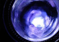
| Great concept, too bad the blue didn't turn out more vivid. |
|
|
|
02/07/2006 08:54:58 AM |
| The image needs to be cropped better. |
|
|
|
02/06/2006 04:22:35 AM |
| wish there was some light shining through the gem |
|
 Photographer found comment helpful. Photographer found comment helpful. |
|
|
02/03/2006 06:42:34 PM |
| Good shot. I wish the jewels would have sparkled more. |
|
| Photographer found comment helpful. |
|
|
02/03/2006 02:14:24 PM |
| Nice idea, but the blue just doesn't stand out here for me. |
|
| Photographer found comment helpful. |
|
|
02/02/2006 11:44:45 PM |
| Seems like the true "blue" of sapphire could have been shown better with better lighting; maybe a bit of back lighting. |
|
| Photographer found comment helpful. |
|
|
02/02/2006 12:39:52 PM |
| The blue gem is not emphasized enough. |
|
| Photographer found comment helpful. |
|
|
02/02/2006 08:14:07 AM |
| the stone wich should have been the point of interest and of blue.. is dull, no color or light on it |
|
| Photographer found comment helpful. |
|
|
02/01/2006 10:38:18 PM |
| Classically elegant composition with nice DOF. |
|
| Photographer found comment helpful. |
|
|
02/01/2006 03:46:11 PM |
| Look more black then blue.. |
|
|
|
02/01/2006 03:13:22 AM |
| I think in different light the stone would look more blue. |
|
| Photographer found comment helpful. |
|
|
02/01/2006 03:03:49 AM |
| Not enough blue in my opinion |
|
Home -
Challenges -
Community -
League -
Photos -
Cameras -
Lenses -
Learn -
Help -
Terms of Use -
Privacy -
Top ^
DPChallenge, and website content and design, Copyright © 2001-2025 Challenging Technologies, LLC.
All digital photo copyrights belong to the photographers and may not be used without permission.
Current Server Time: 03/12/2025 08:31:34 PM EDT.