| Author | Thread |
|
|
02/10/2006 11:35:50 AM |
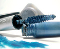
| I gave this a 6 when I voted, but did notice a few things. One, the highlight is saturated and appears to have suffered for it with some pixelation. Two, the lime doesn't look good in either the blue light or your PP color shift. I wonder if you could have lit it with a small penlight or something to give it some more natural color. Technicals are good, but a personal rule of mine is that anything with writing on it needs to be either sharply in focus or completely out of focus. Partially focused letters are a no-no. The eye hates that. If you shot on a tripod, I would have gone with more than f1.8. |
|
 Photographer found comment helpful. Photographer found comment helpful. |
|
|
02/08/2006 07:35:16 PM |
| Thanks Cindi. I was aware of that before I submitted, but I didn't find it particularly displeasing. I suspect you are right though, that is mainly what held it back. I guess that's what I get for starting to shoot at 10:30 on Sunday night... |
|
|
|
02/08/2006 07:23:00 PM |
| I really like this shot. The composition is very nice and the shot is VERY ad-like. I think the only thing that held it back was the hotspot under the glass. I understand that it is the light source, but it distracts from the rest of the composition. |
|
| Photographer found comment helpful. |
Comments Made During the Challenge  |
|
|
02/02/2006 12:37:32 PM |
|
|
|
02/01/2006 09:19:24 AM |
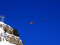
| I wondered if someone would enter a shot of my favourite shot :-) Good composition. |
|
| Photographer found comment helpful. |
|
|
02/01/2006 05:40:15 AM |
| one of the better entries...nice perspective...my only crit is the burned out spot bottom center |
|
| Photographer found comment helpful. |
Home -
Challenges -
Community -
League -
Photos -
Cameras -
Lenses -
Learn -
Help -
Terms of Use -
Privacy -
Top ^
DPChallenge, and website content and design, Copyright © 2001-2025 Challenging Technologies, LLC.
All digital photo copyrights belong to the photographers and may not be used without permission.
Current Server Time: 03/12/2025 11:58:05 PM EDT.