| Author | Thread |
Comments Made During the Challenge  |
|
|
02/14/2006 01:38:53 AM |
| I wish this were more in focus... |
|
|
|
02/13/2006 11:01:17 PM |
| I like this shot... good choice of b&w, the composition is very good.. the way you used light and shadow is excellent |
|
|
|
02/13/2006 04:02:21 PM |
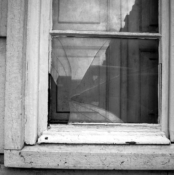
| Interesting reflections within the broken window pain. I wonder if a colored version would of brought out more detail. I think a boost in contrast would of helped and instead of aligning the right side level I think it would of been better (balance) if you would of leveled the bottom of the photograph. Good focus and lighting. I also would of like to have seen the full window not cropped at top. |
|
|
|
02/12/2006 06:10:51 PM |
Nice subject for black & white. I'd try and straighten it out a little. Everything is slipping to the right.
Message edited by author 2006-02-17 21:45:30. |
|
|
|
02/10/2006 08:06:05 AM |
| nice b and w...true to challenge |
|
|
|
02/09/2006 08:40:32 PM |
| lovely concept - pity its black and white .. and pity that it has not been straightened use the three straight vertical lines. |
|
|
|
02/09/2006 03:54:33 PM |
| It is the contradiction implied in the reflection that makes this shot for me - well handled. |
|
|
|
02/09/2006 10:51:16 AM |
| Good texture. IMO, I would make it a bit more contrasty, and straighten the pic a little (I had a similar problem in my entry). |
|
Home -
Challenges -
Community -
League -
Photos -
Cameras -
Lenses -
Learn -
Help -
Terms of Use -
Privacy -
Top ^
DPChallenge, and website content and design, Copyright © 2001-2025 Challenging Technologies, LLC.
All digital photo copyrights belong to the photographers and may not be used without permission.
Current Server Time: 03/12/2025 07:35:18 AM EDT.