| Author | Thread |
|
|
02/15/2006 05:09:41 PM |
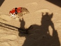
Greetings from the Critique Club
Welcome to DPC! I see this is just your second Challenge and I'll bet you're having fun setting up your shots.
In an abstract sort of way, your Shadows image has merit, but I'm afraid for DPC purposes, it didn't measure up too well. But look at it this way, Gaupi. You have no place to go but up from here on. (joking)
The odd angle and the colors - probably produced by the indoor lighting and high ISO - just pulled this image down in the ratings. My suggestions for improvement might include bracketing your shots and selecting different angles to see which might be most pleasing.
My best advice is to just keep shooting and getting more practice. Soon you'll be up there with the best of 'em.
I'll look forward to seeing more of your work on DPC.
Alice |
|
Comments Made During the Challenge  |
|
|
02/09/2006 06:33:36 PM |
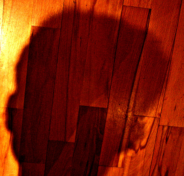
| I like the color and the giant interior mass that is your head. It's suggestive of a rich inner world. 7 |
|
|
|
02/09/2006 08:06:17 AM |
| very hard to make out this shadow and the colours appear to be saturated too much |
|
|
|
02/07/2006 03:42:58 PM |
| Cool use of colour. The floor bugs me because it looks like its tipping over. That's clearly what you intended ... just that it doesn't sit right with this viewer |
|
|
|
02/06/2006 08:18:52 AM |
a bit soft, noisy and oversaturated
also could use some more planning |
|
|
|
02/04/2006 12:57:56 PM |
| I dont know what to say, maybe try harder next time. |
|
|
|
02/03/2006 01:42:48 AM |
| You look like a blob. Sorry. Image just needed to be a little more interesting. |
|
Home -
Challenges -
Community -
League -
Photos -
Cameras -
Lenses -
Learn -
Help -
Terms of Use -
Privacy -
Top ^
DPChallenge, and website content and design, Copyright © 2001-2025 Challenging Technologies, LLC.
All digital photo copyrights belong to the photographers and may not be used without permission.
Current Server Time: 03/13/2025 08:30:50 PM EDT.