| Author | Thread |
Comments Made During the Challenge  |
|
|
02/12/2006 04:34:30 AM |
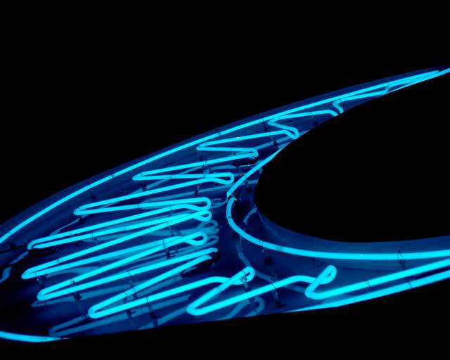
| nice shape, however, as it isn't really abstract, it doesn't meet the challenge too well for me. In terms of the photograph, it probably could be sharpened up a little. Composition is great, I like the large curve outsetting the sharp lines of the neon. The bottom curve is slightly lost which is a shame. |
|
 Photographer found comment helpful. Photographer found comment helpful. |
|
|
02/08/2006 07:11:34 PM |
| This could of been used in the blue challenge too. Nice abstract. |
|
| Photographer found comment helpful. |
|
|
02/07/2006 12:12:09 PM |
| Nice angle to abstract the sign. Placement in the frame is good. Bottom looks "cut off" but I suspect that's a factor of the sign itself. |
|
| Photographer found comment helpful. |
|
|
02/06/2006 11:34:33 AM |
| great color, but it's too easy to tell what it is |
|
| Photographer found comment helpful. |
Home -
Challenges -
Community -
League -
Photos -
Cameras -
Lenses -
Learn -
Help -
Terms of Use -
Privacy -
Top ^
DPChallenge, and website content and design, Copyright © 2001-2025 Challenging Technologies, LLC.
All digital photo copyrights belong to the photographers and may not be used without permission.
Current Server Time: 03/11/2025 02:40:06 PM EDT.