| Author | Thread |
Comments Made During the Challenge  |
|
|
07/19/2003 08:27:48 PM |
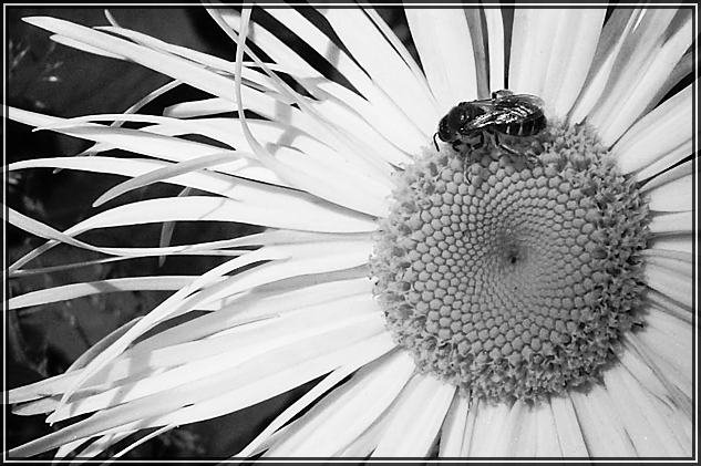
| The black and white feels like it detracts from this image. Hard to say without seeing the color I guess, but how it feels when I look at it. |
|
 Photographer found comment helpful. Photographer found comment helpful. |
|
|
07/18/2003 10:25:53 AM |
| Nicee photo. Maybe reduce the brightness and enhance the contrast. |
|
| Photographer found comment helpful. |
|
|
07/18/2003 12:01:04 AM |
|
| Photographer found comment helpful. |
|
|
07/17/2003 08:56:41 AM |
| I actually think I would like this better in color, seems kind of flat in B&W |
|
| Photographer found comment helpful. |
|
|
07/16/2003 01:16:23 PM |
| beautiful shot. the b/w is a bit harsh though. |
|
| Photographer found comment helpful. |
|
|
07/16/2003 07:20:56 AM |
| The clever title makes this for me (Draws attention away from flower), as otherwise it's just another flower shot -- too much of a cliche. It's just a thought, but was there a chance you could have put the bee on a third, as it is very close? Good focus. 6. |
|
| Photographer found comment helpful. |
|
|
07/16/2003 03:38:32 AM |
| In the past challenge I found most of my "10" votes were black and white shots even though I "think" I prefer color. In this case, I think color would have been better. I like the composition and subject, but this particular photo screams for bright, bright color. |
|
| Photographer found comment helpful. |
|
|
07/16/2003 12:19:55 AM |
| I like the compouure, but would have liked some coulur as well, even if it is just 1 colour, maybe desaturate all but the yellows? |
|
| Photographer found comment helpful. |
Home -
Challenges -
Community -
League -
Photos -
Cameras -
Lenses -
Learn -
Help -
Terms of Use -
Privacy -
Top ^
DPChallenge, and website content and design, Copyright © 2001-2025 Challenging Technologies, LLC.
All digital photo copyrights belong to the photographers and may not be used without permission.
Current Server Time: 04/26/2025 08:47:54 PM EDT.