| Author | Thread |
Comments Made During the Challenge  |
|
|
02/14/2006 10:52:09 PM |
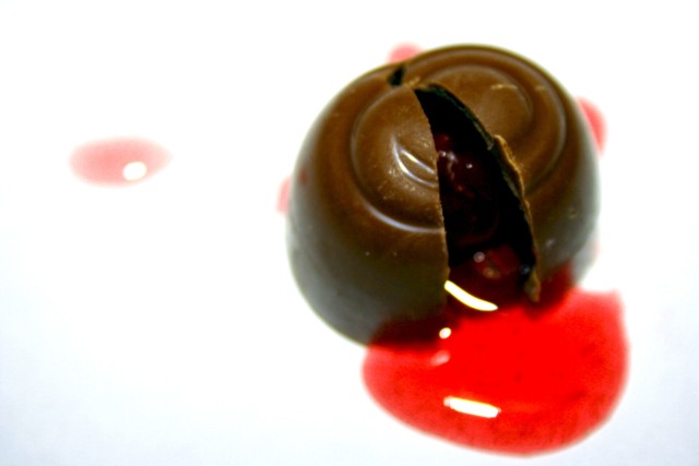
| the focus looks a bit soft to me, a shot like this should be razor crisp |
|
|
|
02/14/2006 09:21:23 AM |
| This stands out as unique, but could be a little sharper. Good comp and original. Taking off a little for sharpness, but not much. |
|
|
|
02/12/2006 03:39:27 AM |
|
|
|
02/11/2006 09:25:29 PM |
|
|
|
02/11/2006 01:50:56 PM |
| my favorite chocolate surprise...focus is toooooo narrow...less delictable |
|
|
|
02/11/2006 01:39:42 PM |
| The light is a little too harsh and the DOF seems too shallow. |
|
|
|
02/10/2006 03:26:24 AM |
| Oh I like this a lot. The only complaint I have is that I wish more of the cherry was in focus, esp. the pooling goo in front. I still love it though. |
|
|
|
02/09/2006 08:46:45 AM |
| i find the shallow depth of field to detract from the great subject. perhaps use external flash, or tripod to allow smaller aperture and greater depth of field. |
|
|
|
02/09/2006 08:29:49 AM |
When I saw the thumbnail for this I had high hopes for this - it is certainly a good idea. I'm new to DPC and haven't seen much of others work yet but there are a few things that spoil this for me ...
1. It's out of focus
2. The lesser red marks to the left and underneath the chocolate are distracting
3. The contents of the chocolate don't have any room to flow into - might have been better to leave more space to the right and below for this. |
|
|
|
02/09/2006 08:19:15 AM |
| The reds are nice, but focus and lighting needs some improvement. |
|
|
|
02/09/2006 03:47:44 AM |
|
|
|
02/08/2006 10:46:06 PM |
| why do you get so many comments and i only got one. (from you) not cool. we totally coulda killed this pic if we had time. |
|
|
|
02/08/2006 09:53:33 PM |
| Was this really 'already broken' ? |
|
|
|
02/08/2006 07:38:07 PM |
| I like this, but it really doesn't seem focused. |
|
|
|
02/08/2006 06:32:21 PM |
| If focus was sharper this shot would be great. As it is, I find myself squinting to try and get it into focus. Nice compositon |
|
|
|
02/08/2006 04:48:27 PM |
| This is a great idea for broken. Who doesn't love to look at rich looking chocolate. I wish it were sharper -- then it would be perfect. |
|
|
|
02/08/2006 01:52:46 PM |
| good idea i wish it was sharper |
|
|
|
02/08/2006 09:01:56 AM |
|
|
|
02/08/2006 07:07:46 AM |
| Seems a little out of focus to me, not sure if thats what you were going for. |
|
|
|
02/08/2006 02:05:45 AM |
| A very good idea. I think that close-ips such as this need to be very sharp. This is so almost a great shot but falls short because of the softness (IMO). |
|
|
|
02/08/2006 01:14:30 AM |
| I like it, bu it looks blur |
|
Home -
Challenges -
Community -
League -
Photos -
Cameras -
Lenses -
Learn -
Help -
Terms of Use -
Privacy -
Top ^
DPChallenge, and website content and design, Copyright © 2001-2025 Challenging Technologies, LLC.
All digital photo copyrights belong to the photographers and may not be used without permission.
Current Server Time: 03/12/2025 05:19:19 PM EDT.