| Author | Thread |
|
|
02/22/2006 06:54:59 PM |
Greetings from the Critique Club
From looking at your portfolio, I see you like to look at the same bridges I do. You have some nice interpretations there.
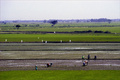
But now, to the image at hand. I can see this nice, almost generically Bolinian tractor very easily in my imagination. YOu've had a bunch of comments on oversharpening, and I won't add to them, although that was the first thing that caught my eye. What did bring me up short was the absence of strong values in this very nice image. I'd love to have seen more darks and real lights in this photo to contrast against the dull, rusty (broken) tractor. I have not personally used the sepia effect (although it's on my list) so I don't know what one would adjust to get more value change. (Or even if you want to. After all, it's your image and you might not agree!)
But I'm trying to figure out why this nice image didn't score much higher. And that may well have something to do with it. In any event, it was a nice find and the compostion works well for this Challenge.
Continued good luck in your DPC entries.
Alice |
|
Comments Made During the Challenge  |
|
|
02/18/2006 01:25:09 PM |
| The effect in the gap between the tire and the post and at the edge of the tree takes a lot away from this shot. |
|
 Photographer found comment helpful. Photographer found comment helpful. |
|
|
02/14/2006 11:19:20 PM |
| Like the tractor, but the post-processing seems over-somethinged to me. |
|
| Photographer found comment helpful. |
|
|
02/14/2006 04:11:23 PM |
| nice shot and true to challenge |
|
| Photographer found comment helpful. |
|
|
02/14/2006 11:55:19 AM |
| This has a glossy look like it belongs on a postcard. Great subject. There is a bit of haloing around the objects that poke into the sky, fence posts and the tree. Good choice of colors also. |
|
| Photographer found comment helpful. |
|
|
02/14/2006 12:07:45 AM |
| Great shot and treatment. |
|
| Photographer found comment helpful. |
|
|
02/13/2006 09:24:47 PM |
| Cool picture. Love the coloring. |
|
|
|
02/13/2006 08:11:42 PM |
| Love the nostalgic feel that your duotoning accomplished here. Beautiful. |
|
| Photographer found comment helpful. |
|
|
02/13/2006 06:59:32 PM |
| a bit more contrast could have helped overall pic tone |
|
| Photographer found comment helpful. |
|
|
02/13/2006 04:58:32 PM |
| to me the sepia dosn't work well on this shot. Natural would have been better to me. Great subject though. |
|
| Photographer found comment helpful. |
|
|
02/13/2006 01:44:10 PM |
| Carefull with sharpening, I see halos around all edges... |
|
| Photographer found comment helpful. |
|
|
02/13/2006 03:51:45 AM |
| Interesting subject but the work around the sky is visible. Also, I'm not sure that the way your mon has been done works, it looks a little weird but I'm not sure how you've done it so can't be helpful with any suggestions right now. |
|
| Photographer found comment helpful. |
|
|
02/13/2006 01:02:30 AM |
| Nicley done, but let down by the halo's around the trees and posts...5 |
|
| Photographer found comment helpful. |
|
|
02/13/2006 12:54:10 AM |
| There is something un-natural about the color of the sepia tone. It's too intense and brown. |
|
| Photographer found comment helpful. |
|
|
02/13/2006 12:37:09 AM |
| Your dodge/burn artifacts are too visible in the final image. This is a shot that could possibly be better if you look for other conditions... |
|
| Photographer found comment helpful. |
Home -
Challenges -
Community -
League -
Photos -
Cameras -
Lenses -
Learn -
Help -
Terms of Use -
Privacy -
Top ^
DPChallenge, and website content and design, Copyright © 2001-2025 Challenging Technologies, LLC.
All digital photo copyrights belong to the photographers and may not be used without permission.
Current Server Time: 03/13/2025 09:06:38 AM EDT.