| Author | Thread |
|
|
03/05/2006 04:40:29 AM |
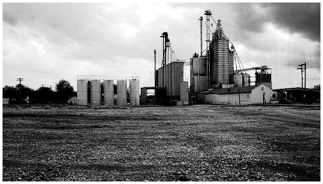
| You have a wonderful subject, here. I hope you go back an re-visit it sometime. Someone once told me to always look for the photo within the photo... I think in this case, a closer look at the structure with finer detail would have improved your score. Your conversion to duotone was well done. |
|
 Photographer found comment helpful. Photographer found comment helpful. |
|
|
03/02/2006 08:06:26 AM |
| The only negative I readily notice on this shot is that it is too centered. I think if you were to have cropped a little of the ground out from under the building this might have shot up a bit further in the points. I personaly like the photo I probably would have given it a 6 while voting on it in a challenge. While it is not an awe inspiring photo it is crisp and has great texture. Sorry to see this photo was not as well received as I think it should have been. Best of luck in the future. |
|
| Photographer found comment helpful. |
|
|
03/01/2006 02:16:24 AM |
I hope you see my comment as constructive and helpful in your pursuit to improve your photos ;)
My first impression of this image is that it is a well taken shot. Too much ground IMHO. I think with a greater expanse of the sky serving the negative space, this would have been up there. The tonal qualities are good but could use slight improvement. As you can see, some of the trees almost go to black in the background. The noise helps this image. It adds a certain flavor to the whole composition.
Keep on practicing but most importantly have fun! This is a great image!
Cheers,
Rikki
Message edited by author 2006-03-01 15:45:55. |
|
| Photographer found comment helpful. |
|
|
03/01/2006 12:59:27 AM |
| It's not a bad shot. I didn't make it to this one in the voting. The biggest problem is the sky not having enough definition because of the exposure. I see you were already on 1/1000th. Perhaps a different time of day? or with a polarizer or ND filter? The horizon exactly splits the picture, which isn't always bad, but probably is a bit static here. I see you were trying to contrast the expanse of blank with the building, but perhaps less dirt would have been better in the end. I would have given it a 5, which is right where you finished. |
|
| Photographer found comment helpful. |
Comments Made During the Challenge  |
|
|
02/23/2006 12:18:54 PM |
| I love the noisegrain in this picture |
|
| Photographer found comment helpful. |
|
|
02/22/2006 11:00:07 AM |
| Nice contrast and detail. I like the sunrays there on the right of the frame. Adds a bit of organic beauty to the factory setting. |
|
| Photographer found comment helpful. |
Home -
Challenges -
Community -
League -
Photos -
Cameras -
Lenses -
Learn -
Help -
Terms of Use -
Privacy -
Top ^
DPChallenge, and website content and design, Copyright © 2001-2025 Challenging Technologies, LLC.
All digital photo copyrights belong to the photographers and may not be used without permission.
Current Server Time: 03/12/2025 08:06:48 PM EDT.