| Author | Thread |
Comments Made During the Challenge  |
|
|
02/28/2006 09:25:37 AM |
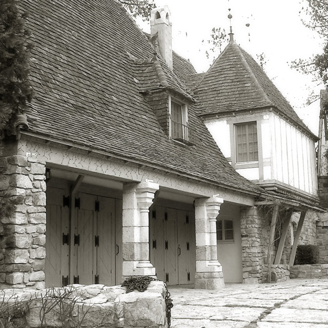
| Nice idea, but for me it lacks harmony. There is too much everything (different types of stonework, so many roof tiles, windows, doors). The eyes are forced to jump about, rather than relax and enjoy the image. |
|
 Photographer found comment helpful. Photographer found comment helpful. |
|
|
02/26/2006 12:42:08 AM |
| I like the angle, but maybe could benefit from more contrast, the white paint/wood is too bright. |
|
| Photographer found comment helpful. |
|
|
02/24/2006 09:42:19 PM |
| The white part of the house seem a little over exposed. |
|
| Photographer found comment helpful. |
|
|
02/24/2006 06:27:35 PM |
| this would probably look a lot better if you played with levels a bit to get more contrast. |
|
| Photographer found comment helpful. |
|
|
02/24/2006 07:32:27 AM |
| Needs a bit more contrast in my opinion. |
|
| Photographer found comment helpful. |
|
|
02/24/2006 07:21:41 AM |
| Really nice contrast and detail. Not one of those wow shots, though. I notice the chain in the foreground. I have a feeling that cutting out much of the comp and focusing on the tones and textures where the chain is would be more interesting. |
|
| Photographer found comment helpful. |
|
|
02/23/2006 10:58:48 PM |
| i like this shot, but i think it's a bit overexposed, causing an overall grayish tone and extremelly white areas especially prevalent in the sky and the wall to the top right... |
|
| Photographer found comment helpful. |
|
|
02/23/2006 12:58:17 PM |
| Nice details and exposure. Great composition. |
|
| Photographer found comment helpful. |
Home -
Challenges -
Community -
League -
Photos -
Cameras -
Lenses -
Learn -
Help -
Terms of Use -
Privacy -
Top ^
DPChallenge, and website content and design, Copyright © 2001-2025 Challenging Technologies, LLC.
All digital photo copyrights belong to the photographers and may not be used without permission.
Current Server Time: 03/12/2025 02:02:49 AM EDT.