| Author | Thread |
Comments Made During the Challenge  |
|
|
02/27/2006 09:30:54 PM |
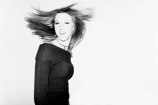
| Nice movement. I like the contrast. |
|
|
|
02/27/2006 08:33:54 PM |
| Interesting picture, but I think it could have been more powerful with a closer crop! |
|
|
|
02/27/2006 02:53:44 PM |
|
|
|
02/25/2006 08:13:05 PM |
| Her face seems a litte washed out. Nice catch of the hair and good use of thirds. |
|
|
|
02/23/2006 11:40:28 PM |
| cute pose. however, i think this shot could have benefitted from less flash. her face is too white and is not very fitting against the already white background. the black shirt also reflects a lot of brightness. less harsh light can bring out more flattering realistic fleshtones... |
|
|
|
02/23/2006 01:34:07 PM |
| what an expression, haha. |
|
|
|
02/23/2006 06:37:40 AM |
| would be good ad for toothpaste maybe? a good fun shot. 8 |
|
|
|
02/22/2006 10:12:51 AM |
|
|
|
02/22/2006 09:49:28 AM |
| Cute. I like the whimsy of it. THis would've almost worked in "Fashion" too. |
|
|
|
02/22/2006 09:03:44 AM |
|
Home -
Challenges -
Community -
League -
Photos -
Cameras -
Lenses -
Learn -
Help -
Terms of Use -
Privacy -
Top ^
DPChallenge, and website content and design, Copyright © 2001-2025 Challenging Technologies, LLC.
All digital photo copyrights belong to the photographers and may not be used without permission.
Current Server Time: 03/15/2025 02:07:59 AM EDT.