| Author | Thread |
Comments Made During the Challenge  |
|
|
02/28/2006 11:13:49 PM |
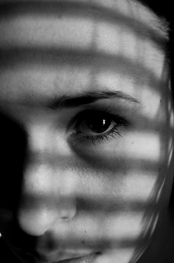
| I think a crop off the top to bring the centre of the eye closer to the thirds conjunction may have increased the visual impact of this shot. |
|
|
|
02/28/2006 12:52:27 PM |
|
|
|
02/27/2006 05:45:05 PM |
| I really like how the models eye stands out .. choice of duotone was a good one.... I think I would like the shadows from the blinds to be a little lighter - I don't think it would spoil the mood you are going for - personal choice here |
|
|
|
02/25/2006 10:37:22 AM |
| Interssting. You created the lines from blinds- right? |
|
|
|
02/23/2006 03:51:18 PM |
| similar to my shot! haha nice light in her eye |
|
|
|
02/22/2006 05:46:03 PM |
| Great look captured. The shadow across the eye is especially effective. Nice contrast. Shows just enough. |
|
|
|
02/22/2006 11:10:52 AM |
| The eye is a little too centrc. I'd like to see a tighter crop to put the eye at more of the upper/right third of the frame. |
|
 Photographer found comment helpful. Photographer found comment helpful. |
|
|
02/22/2006 08:19:14 AM |
|
|
|
02/22/2006 05:16:32 AM |
| The shadows are not sharp enough. It blurrs her face, unfortunately. Concerning the framing, I would have shown less forehead, she looks bald like that |
|
| Photographer found comment helpful. |
Home -
Challenges -
Community -
League -
Photos -
Cameras -
Lenses -
Learn -
Help -
Terms of Use -
Privacy -
Top ^
DPChallenge, and website content and design, Copyright © 2001-2025 Challenging Technologies, LLC.
All digital photo copyrights belong to the photographers and may not be used without permission.
Current Server Time: 03/16/2025 01:33:37 PM EDT.