| Author | Thread |
Comments Made During the Challenge  |
|
|
02/28/2006 09:17:34 PM |
| I really like this but in the top left hand there seems to be too much light? but anyway 8 |
|
|
|
02/28/2006 12:50:33 PM |
| A little soft. Could be sharper. Nice shot. |
|
|
|
02/28/2006 11:03:02 AM |
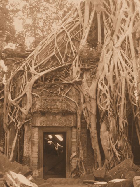
| On my screen the tone is too pinkish and overall the light obscures some of the detail that would give more impact if it were darker. The composition is good and the subject is very interesting. In this case I think the tone compromises the overall value of the image. |
|
|
|
02/26/2006 09:59:33 PM |
| Very cool subject, but the contrast appears way too high on my monitor... simple curves or levels could fix this right up. |
|
|
|
02/26/2006 01:50:36 PM |
| Very nice. Your choice of duotones does a great job of conveying the ancientness of this special place. |
|
|
|
02/26/2006 12:20:06 AM |
| love the composition of this shot and the colours work well. I think adding more contrast and a levels layer to avoid blowing the highlights would help it to really pop. |
|
|
|
02/25/2006 03:54:49 PM |
| duotone - yes, but too flat |
|
|
|
02/25/2006 05:20:16 AM |
| Looks like an old WWII photo and really got my attention. 8 |
|
|
|
02/25/2006 02:08:52 AM |
| needs bump in contrast. Amazing house though |
|
|
|
02/24/2006 01:47:01 PM |
Wonderful old looking style !
Just can add that I wish I were there. |
|
|
|
02/23/2006 11:29:03 PM |
| i really like the setting you captured! however, the entire shot seems underexposed... |
|
|
|
02/23/2006 08:44:22 PM |
| Had the overall image been more in focus, I would have scored this better. I like the sepia tone. It gives your shot an old feel for me. Great overgrowth. |
|
|
|
02/23/2006 08:57:43 AM |
| i would have liked higher contrast but that's just me |
|
|
|
02/22/2006 10:32:54 AM |
| Lacks contrast. Interesting subject though. The image has an "aged" feel to it which is nice. |
|
|
|
02/22/2006 03:04:31 AM |
| i am not sure this color enhances the photo. |
|
|
|
02/22/2006 01:18:57 AM |
| great concept for this challenge, very interesting and suits an old photo look |
|
|
|
02/22/2006 12:48:10 AM |
| An interesting subject. I like the composition. I'm thinking the presentation could be stronger with more contrast. Maybe just some levels tweaking could greatly enhance the light to dark tonal range. It seems just a little 'flat' here. |
|
Home -
Challenges -
Community -
League -
Photos -
Cameras -
Lenses -
Learn -
Help -
Terms of Use -
Privacy -
Top ^
DPChallenge, and website content and design, Copyright © 2001-2025 Challenging Technologies, LLC.
All digital photo copyrights belong to the photographers and may not be used without permission.
Current Server Time: 03/16/2025 12:31:26 PM EDT.