| Author | Thread |
|
|
02/27/2006 11:16:42 AM |
Greetings from the Critique Club
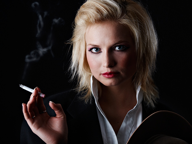
I think this suits the challenge quite well. It demonstrates the 'Smoking is Cool' mentality that prevailed in the 80's and the excessive make-up styles used then. My criticism for make-up and hair would be that it's too subtle. The 80s were known for drastic colors in both hair and make-up. Girls often had streaks of color in their hair as well as the use of non-conventional colors of eye-shadow. Also, the decade was known for 'big hair' which I would have to say hers doesn't make me think. In any case, on to the technicals.
Composition:
Composition is quite good here. I'm distracted by the fact that some of her hair is cut off on the top. The positioning of her and her hand in the frame is excellent.
Lighting:
I love the lighting here. Great use of indirect lighting to lend interest to the shot by having her face and hand partially illuminated.
Post-Processing:
I would've preferred some more detail in her clothes. As it is, she's in black on a black background with no contrast between the two. Some dodging to give a little texture to her clothes would've been nice so there was a difference from the background and she wasn't a floating head.
Suggestions/Improvements:
Lighting or dodging on her jacket to bring her out of the background. More make-up and hair. She looks like she could've been pulled off of the street as it is and be only mildly out of fashion. The main selling point for the 80s here is in the pointy eyeliner. Don't cut off the top of her head...it's important since it's hair and makeup that sell the picture to the challenge.
I hope this was useful to you, and please feel free to contact me via PM if you have any questions regarding this critique.
Regards,
Zeke Smith
|
|
 Photographer found comment helpful. Photographer found comment helpful. |
|
|
02/27/2006 10:42:15 AM |
| Congratulations on your top 20 with this poster like presentation. This image comes out at the viewer! |
|
| Photographer found comment helpful. |
Comments Made During the Challenge  |
|
|
02/26/2006 08:13:35 PM |
| Nice, looks like the 80's. |
|
| Photographer found comment helpful. |
|
|
02/26/2006 05:23:22 PM |
| This one realy takes me bak to the 80's. Duran Duran look and all. |
|
| Photographer found comment helpful. |
|
|
02/26/2006 01:13:08 PM |
Can't give you top scores without blue eyeshadow...
TC |
|
| Photographer found comment helpful. |
|
|
02/26/2006 05:42:33 AM |
| Gotta be top 3.... this just screems 80's Excellent work. |
|
| Photographer found comment helpful. |
|
|
02/24/2006 09:58:37 AM |
|
| Photographer found comment helpful. |
|
|
02/24/2006 04:11:38 AM |
| Tack sharp image. great lighting. |
|
| Photographer found comment helpful. |
|
|
02/22/2006 05:22:38 PM |
| Nice image... I actually thought it was Deborah Harry for a second... nice job... :) |
|
| Photographer found comment helpful. |
|
|
02/22/2006 03:00:34 PM |
She has a bit of a dolly dot look and that bit of lipstick on the cigarette: so typical. :) This is how all the (older) girls in my old 80's neighbourhood looked. And now I have that song in my head the whole evening.
Perhaps the balance of light is a bit out of balance on the face. Too dark at the right, maybe a reflector might have worked there.
Does she have a hat in her hand? It looks a bit out of place at the bottom right.
IMO this one is better as Gary's entry. :) |
|
| Photographer found comment helpful. |
|
|
02/22/2006 04:46:57 AM |
| The colours are so natural. I really like this photo. |
|
| Photographer found comment helpful. |
|
|
02/21/2006 07:52:47 AM |
| Good lighting, lovely model, I don't like cigarettes in pictures, so that's the only drawback for me :) |
|
| Photographer found comment helpful. |
|
|
02/20/2006 12:54:04 PM |
| Nice Portrait, but smoking really was not just an 80's thing. I grew up in the 70's and it was just as big then. So, 9 for good portrait shot, minus 2 for not really meeting the challenge. (7) |
|
| Photographer found comment helpful. |
|
|
02/20/2006 11:37:13 AM |
| Nice capture overall, I like the light to shadow from left to right and the look on the model is very nice. A good portrait shot on the whole but it doesn't really say 80's to me in that sense, this could be from any decade. A 7 |
|
| Photographer found comment helpful. |
|
|
02/20/2006 03:07:40 AM |
| ok if that was how they were. |
|
| Photographer found comment helpful. |
|
|
02/20/2006 02:13:58 AM |
| great portrait with nice lighting |
|
| Photographer found comment helpful. |
|
|
02/20/2006 01:18:38 AM |
| Nice image. But the makeup needs to be really smudged around the eyes and her nails should be darker and not a french manicure (sorry, I was there. LOL) But the picture is well done and the lighting is terrific. |
|
| Photographer found comment helpful. |
Home -
Challenges -
Community -
League -
Photos -
Cameras -
Lenses -
Learn -
Help -
Terms of Use -
Privacy -
Top ^
DPChallenge, and website content and design, Copyright © 2001-2025 Challenging Technologies, LLC.
All digital photo copyrights belong to the photographers and may not be used without permission.
Current Server Time: 03/11/2025 02:09:54 PM EDT.