from the Critique Club
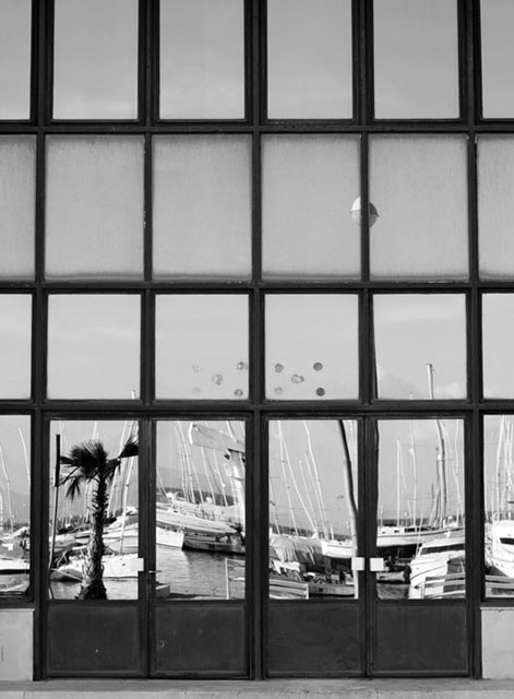
To a certain extent, a complicated and difficult submission, and, I think, partially successful. What seems to be you point, from your notes, is lost in the mad rush of voting I think, especially in a challenge with over 600 entries. The image just doesn't have the immedaite impact to grab the passing voter's eye. A couple of things I think would go some way to correcting that: firstly, more detail - this just doesn't have that impression of the finest detail being visible. Whether that's down to your lens, shutter speed causing slight image blur, or what is difficult to say without the imformation. Secondly I think the rigid graphic structure provided by the window frames and doors needs to be absolutely square - the slight distortion towards the top of frame gives the image a sense of carelessness, and is the kind of thing that registers immediately with the subconscious.
The difficult and confising world of mirrors can make for a powerful image - but here I think the reflections work against you - just too confusing and busy for small screen viewing, and the secret of the shot (the invisible photographer) takes too much attention to work out quickly. It would be a great punchline to an image that had already grabbed the attention - this just doesn't have that grab.
A neat idea for the challenge though, despite those points. Shows an understanding of the emphasis duotones/monochrome photography places on the graphic nature of its subject.
e |