| Author | Thread |
|
|
03/01/2006 04:23:51 AM |
from behind the freezer of the Critique Club
I find the range of hyper-picky historico-pedantic comments rather hard to take, even as a disinterested dearder of someone else's comments. What the hell is the point of that? And it's made especially pointless when a bunch of supposedly 'punk' images dominate the ribbons in this challenge.
Well, I'm afraid there's no defense against the small-minded other than to go along one's way, without letting such things get under one's skin, but it can be hard: it seems there's almost a desperation to find some way, any way to dismiss an image from proper consideration in a challenge.
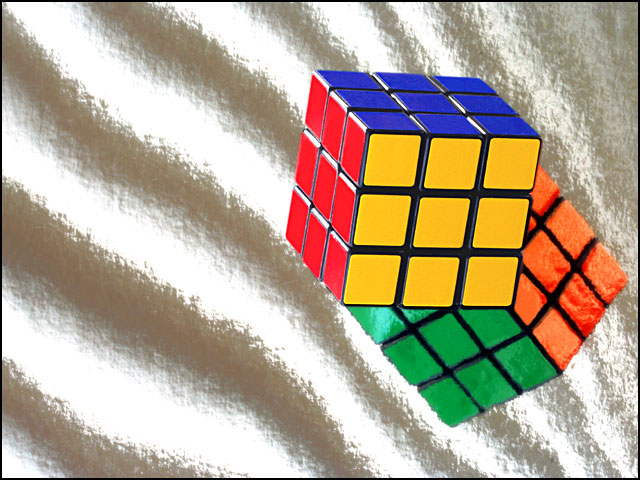
There are a couple of things I do like here, and a couple I think may prove to have been optimistic ideas. The brightness, almost the brashness of the image seems to me very fitting to the period we were asked to imitate - and of course the subject and your treatment of it is absolutely OK. Your shiny material - and the sand-like quality that you've noticed, causes problems though: precisely because it does look so much like sand, I suspect many people will have actually taken it for sand, and decided that you've over-exposed your background - despite the evidence of the reflection of the cube. Unravelling that, however small, visual puzzle is asking for more time from the punters than a first shoot through is going to get you, though.
|
|
 Photographer found comment helpful. Photographer found comment helpful. |
Comments Made During the Challenge  |
|
|
02/26/2006 08:12:29 PM |
| Interetsing, good reflection. Not fond of the too bright background. |
|
| Photographer found comment helpful. |
|
|
02/26/2006 04:02:58 PM |
|
| Photographer found comment helpful. |
|
|
02/24/2006 04:14:10 AM |
| Ah the infamous Rubik's cube. In as much as this was developed and created in the 70's, I think this really boomed in popularity in the 80s. The colors are sharp but the background leaves questions to be asked. The highlights are a bit too bright here which I think will be the pitfall for this image. Positioning of the cube is spot on with ROTs. Good luck. |
|
| Photographer found comment helpful. |
|
|
02/23/2006 11:43:59 PM |
| Simple, vibrant, nicely focused. Gave a 6. |
|
| Photographer found comment helpful. |
|
|
02/21/2006 09:23:02 AM |
| The background is really interesting.. What is it? :) I like the clarity on the RC... it's completed, though, which makes me jealous, lol. :) |
|
| Photographer found comment helpful. |
|
|
02/21/2006 07:48:13 AM |
| I like the texture of the background (is it a towel ?) .. don't like the "floating-in-mid-air" feeling I get :) |
|
| Photographer found comment helpful. |
|
|
02/20/2006 05:28:34 PM |
| how have you managed to finish it!! |
|
| Photographer found comment helpful. |
|
|
02/20/2006 12:57:27 PM |
|
| Photographer found comment helpful. |
|
|
02/20/2006 08:54:09 AM |
| Nice image, only missing the white side! |
|
| Photographer found comment helpful. |
|
|
02/20/2006 08:40:39 AM |
| There are a lot of Rubic's Cubes in this challenge, but unfortunately, although some may have played with it in the 80's, it was really created in 1975. Therefore, the cube was really a 1970's craze, and not an 80's craze.Rubik's Cube was developed in 1975 by Ernö Rubik, a Hungarian professor of mathematics |
|
|
|
02/20/2006 01:47:07 AM |
|
| Photographer found comment helpful. |
Home -
Challenges -
Community -
League -
Photos -
Cameras -
Lenses -
Learn -
Help -
Terms of Use -
Privacy -
Top ^
DPChallenge, and website content and design, Copyright © 2001-2025 Challenging Technologies, LLC.
All digital photo copyrights belong to the photographers and may not be used without permission.
Current Server Time: 03/12/2025 04:23:07 AM EDT.