| Author | Thread |
|
|
03/04/2006 10:55:58 PM |
*Critique Club*
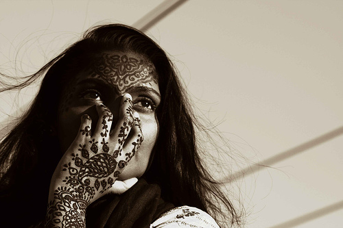
"Designer Thoughts" is a very nice entry into the Duotones challenge. I think the two tones you selected was very appropriate for the image, I think black and white would not have done this justice. I really like the warm feel from this color.
The image is very striking. The patterns in this piece are the first things that grab my attention as a viewer. The deep henna is a wonderful contrast between the beautiful girl and background lines. The lighting is also very prefect, I love how it captures her eyes. Even with the henna the focus for me is her engaging eyes. I also like that her hair is free and flowing giving a nice soft movement, transisitoning us to the background. The score you received seems pretty decent, I am sure it would have scored better with a bigger image. Overall this is a great piece and the textures are just amazing. |
|
 Photographer found comment helpful. Photographer found comment helpful. |
Comments Made During the Challenge  |
|
|
02/28/2006 11:27:32 PM |
|
| Photographer found comment helpful. |
|
|
02/26/2006 10:05:34 PM |
| Great pic, you probably got this a lot, but the size of the image is a bit small. I think the lines are great in the background, they had to the whole effect. |
|
| Photographer found comment helpful. |
|
|
02/26/2006 09:43:18 PM |
| Very nice. I like the detail. If this was only bigger I think the results would be a lot better. |
|
| Photographer found comment helpful. |
|
|
02/23/2006 11:54:08 PM |
| you captured a very intriguing and mysterious subject! i just wish that there was more direct light so that the left side of her face and hair weren't so dark... |
|
| Photographer found comment helpful. |
|
|
02/23/2006 10:35:08 PM |
| Nice portrait but why cover her mouth and nose? |
|
| Photographer found comment helpful. |
|
|
02/23/2006 04:28:42 PM |
| why use lesser pixels if 640 is the allowed limit ? I would have loved to see more details in the Mehandi used here |
|
| Photographer found comment helpful. |
|
|
02/23/2006 05:01:27 AM |
| Unusual. Great impact too, and not just because of the body art. The lighting and composition are very effective, and the simple background motif is used brilliantly for your intended purpose. The toning is excellent. It would have been even better in the maximum allowed size ... it's such a clever and thoughtful photograph that I'm wondering if your under-sizing was deliberate? If so, it's the only choice you made that I can't support. 7. |
|
| Photographer found comment helpful. |
|
|
02/22/2006 05:35:29 PM |
| nteresting shot... good use of light/tone and the simple background really works |
|
| Photographer found comment helpful. |
|
|
02/22/2006 04:12:41 PM |
|
| Photographer found comment helpful. |
|
|
02/22/2006 10:06:14 AM |
| The henna reallys gives this great texture!!! |
|
| Photographer found comment helpful. |
Home -
Challenges -
Community -
League -
Photos -
Cameras -
Lenses -
Learn -
Help -
Terms of Use -
Privacy -
Top ^
DPChallenge, and website content and design, Copyright © 2001-2025 Challenging Technologies, LLC.
All digital photo copyrights belong to the photographers and may not be used without permission.
Current Server Time: 03/14/2025 06:30:03 PM EDT.