| Author | Thread |
|
|
06/05/2006 12:40:09 AM |
| good. how about take this by d70s for second time? |
|
|
|
03/06/2006 10:23:52 AM |
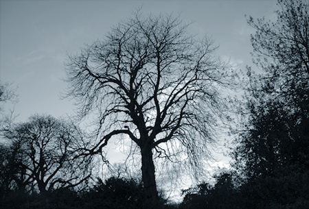
Greetings From the Critique Club!!!
Initial impact: oooh cool tree. Too bad the pictures so small.
Color: Nice very nice. I love the cool blue, and grey hues in the sky. And the three is nicely sihloutted in a solid black.
Contrast: I don't think it's possible to have more.. No complaints in that area.
Focus: It looks to be a little OOF but not badly. But then after looking at it for a bit I see it might just be all of the little branches on the outside perimiter of the tree.
Composition: This is the killer of this photo. First it's too small. This prevents the veiwer from enjoying all of the smaller detaily you captured. Second it is too centered giving it a snap shot feel. I think this would have benifited a lot from the rule of thirds. Perhaps cropping out the trees on the side a bit, adding more sky above the tree until the tree was about one third- two thirds up the photo. This would have alowed you the oppotunity to show off the realy nice sky. And emphasize the center of intrest (the creepy tree) by eleminating some of the clutter around it.
Overall: a pretty good photo, but by making the image lager and playing with the coposition a bit this could have placed a lot higher.
Best of luck in future challenges
Tristalisk |
|
Comments Made During the Challenge  |
|
|
02/28/2006 12:53:15 PM |
| To small make 640 next time |
|
|
|
02/26/2006 07:47:52 PM |
| This has potential.. it's a really interesting tree, but I think it's a bit too centered. With a different composition, this could have worked really well. |
|
|
|
02/24/2006 11:02:26 PM |
|
|
|
02/23/2006 02:24:13 AM |
| Little bit small but I like the color |
|
|
|
02/22/2006 08:32:23 PM |
| The lighting is interesting. Is this a night shot? |
|
Home -
Challenges -
Community -
League -
Photos -
Cameras -
Lenses -
Learn -
Help -
Terms of Use -
Privacy -
Top ^
DPChallenge, and website content and design, Copyright © 2001-2025 Challenging Technologies, LLC.
All digital photo copyrights belong to the photographers and may not be used without permission.
Current Server Time: 03/12/2025 02:33:10 AM EDT.