Greetings from the Critique Club
by strangeghost
The first three parts of this critique are written based purely on examination of your photo. "Final thoughts" is written after reviewing your score, photographer's comments, and voter comments.
TECHNIQUE
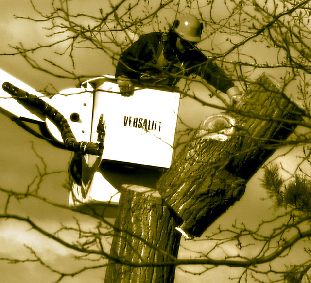
There are a few technical issues that are fairly evident in this pic. First, the white of the cherry-picker bucket is awfully overexposed. There's also a spot on the bottom of the sawed section of the tree that appears blown. Second, both the tree and the bucket seem tipped over toward the right. This gives the image a very unbalanced feel, disconcerting to most viewers. Focus is not bad. Sharpness clearly suffers in the blown areas, even to the point of drowning out branches where they pass in front. I like your choice of duotone conversions. The browns mesh nicely with your subject.
COMPOSITION
The tilt is problematic, as noted above. Aside from that, the foreground branches may bother some, but given that your subject is a tree cutter, it's more context than clutter. The composition is very centered and not especially interesting. There's no clear point of focus implied. Too bad you couldn't isolate the guy's face and get an expression of intensity, or concentration, or some such. Or a focus on the textures of the tree, or the saw in action, etc. Without a clear focal point, the eye doesn't know where to go and lock, and there's no commanding theme to anchor in the viewer's mind.
EMOTIONAL IMPACT
Pretty bland, I'd say. It really amounts to a shot of a person working. There's no implied drama, no obvious tension, no questions raised in the mind of the viewer. There's nothing here to grab my mind and eye and keep me engaged. I hate to assign the epithet of "just a snapshot" but that's what comes to mind.
FINAL THOUGHTS
Your shortage of comments and disappointing final score indicate that voters felt the same lack of draw or appeal that I did. DPC challenge shots generally need some eye appeal and "wow" factor to score well. In a duotone challenge, where bright colors are pretty much ruled out, need to have technical perfection, and a focal point to give interest; perhaps the textures of the tree bark, or the facial expression of the worker. Some point of interest such as this would have given the image a clear focal point in which to engage the viewer. |