| Author | Thread |
|
|
03/07/2006 05:56:13 PM |
The comment below was made through the Critique Club, after I'd had about seven images in a row from a previous challenge - 'the 80's'
I completely failed to realise that this image was from a different challenge - but I think it's interesting whether or not I said anything useful under those conditions, so I've left it to stand. |
|
 Photographer found comment helpful. Photographer found comment helpful. |
|
|
03/02/2006 04:59:28 AM |
from the back of the class of the Critique Club
you really need a critique, Manny? And from me?
I'd be intrigued to know, given your chosen approach to photography (i.e. the portrait) - (at least as your work is presented to us at DPC) - whether your experience of the 80's is actually one of female fashion, or whether this is just the kind of photograph you take. Whether or no, you certainly have a stronger grasp of the period than the winners of this challenge - I find it bizarre that even in the wonderfully ephemeral world of street fashion the general belief is that the 'punk thing' was part of the 80's, rather than the 70's.
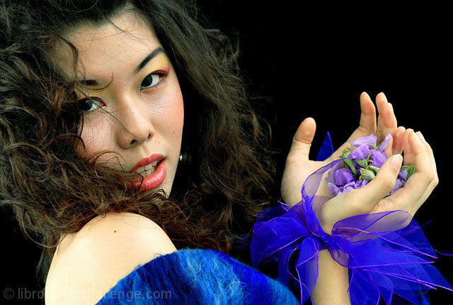
And the use of 4500? Challenging yourself? Not carrying the D200 everywhere? But you still proove that your technical finesse is not dependent on the expense of your camera. There is of course nothing to 'criticise', and nothing to 'critique' in your technical work - I'm more than certain that I could teach you nothing, anyhow. I would make the point that you've probably sacrificed too much frame-space to her face, and cropped too much of the clothing to really make this register for this challenge - unless this is intended as an illustration of period make-up, in which case your title is, at the very least, strange. Off-the-shoulder mohair is definitely of the time (oh, I remember some of my sister's friends ...), and probably the little wristlets, but in this image I think you've just relegated them too far for immediate impact - and without your trademark lighting the face doesn't quite register with your usual punch. The detail, colour, focus, and composition are as ever exemplary, although, to my eye, rather obvious and expected.
For an important historical period - the end and ending of the soviet experiment was as momentous worldwide as any other event of the 20th century, certainly in terms of its effects on people; the first sowing of the roots of the digital community likewise growing to move us into the strange new world we're part of - people's choices of ways to illustrate it are proving to be rather bizarre; but of course, ther's something of a fear of the serious here, so it's difficult to assess.
All the best
Ed |
|
| Photographer found comment helpful. |
Comments Made During the Challenge  |
|
|
02/28/2006 11:46:03 PM |
| I think the brightness of the blue in this really detracts from a great picture-it's much too distracting. The purple flowers and the red lips would have been a good amount of color. |
|
| Photographer found comment helpful. |
|
|
02/28/2006 10:39:06 PM |
| very nice-colors and pose |
|
| Photographer found comment helpful. |
|
|
02/28/2006 09:42:56 AM |
| I love the color but the hair in her face is a little distracting. |
|
| Photographer found comment helpful. |
|
|
02/27/2006 12:45:07 AM |
| Liked the lighting and saturation here. |
|
| Photographer found comment helpful. |
|
|
02/26/2006 07:38:09 PM |
| I nearly missed this one - glad I didn't. Very nice. great color saturation and skin tones. great eyes. the only thing that stands out as a slight distraction is that her right shoulder seems a bit over-exposed on my computer. - 9 |
|
| Photographer found comment helpful. |
|
|
02/26/2006 09:37:47 AM |
| Good color and composition. It has good power and intrest. Like many entries, there is some distracting excess hair (tough doing this in basic edit). |
|
| Photographer found comment helpful. |
|
|
02/25/2006 06:44:01 PM |
|
| Photographer found comment helpful. |
|
|
02/25/2006 04:22:20 PM |
| Vivid colors, beauty, and most definitely 'in fashion' |
|
| Photographer found comment helpful. |
|
|
02/25/2006 10:24:42 AM |
| fine details and good capture. |
|
| Photographer found comment helpful. |
|
|
02/25/2006 01:33:50 AM |
| Very striking, excellent use of colors. |
|
| Photographer found comment helpful. |
|
|
02/25/2006 12:11:40 AM |
|
| Photographer found comment helpful. |
|
|
02/24/2006 11:06:11 PM |
|
| Photographer found comment helpful. |
|
|
02/24/2006 07:20:12 AM |
| don't like her pose.. like the photo but not her expression.. :S humm how tho gread.. well ist a 7 from me |
|
| Photographer found comment helpful. |
|
|
02/23/2006 02:42:31 PM |
|
| Photographer found comment helpful. |
|
|
02/23/2006 04:54:57 AM |
| Yep, I liked the other one more... |
|
| Photographer found comment helpful. |
|
|
02/22/2006 09:25:16 PM |
| Vibrant colors, great composition, good subject for the competition. Well done! |
|
| Photographer found comment helpful. |
|
|
02/22/2006 08:58:44 PM |
|
| Photographer found comment helpful. |
|
|
02/22/2006 10:21:01 AM |
| In fashion photography and in using a model in this way, one takes great risk to be a truly acceptable photo in fashion - especially in this arena of only using basic editing. Here is the good and bad I see here: The good is the facial expression is very nice and emits emotion and the skin is nice, although could have used some retouching if it was able to be done. I also like the pose and the colors. The bad is that she is only holding flowers, and holding an item like perfume would have been better for fashion. I don't see how the flowers work here or what the meaning is. The make up is a bit over done and the yellow on the eye doesn't work with her skin tone. The lipstick is ok, but seems not enough on her left bottom lip. And more attention needed to be paid to the position of the hands. One is good, but the other looks a bit scrunched then the other which distracts. Also the hair tends to over power the right side of her face. Modeling is not an easy job, and even with the most revered models, many shots have to be taken (sometimes hundreds of frames) to get just the right one. So my hats off to you for your risk and effort. All in all I think this is a very good photo and voted it so. |
|
| Photographer found comment helpful. |
Home -
Challenges -
Community -
League -
Photos -
Cameras -
Lenses -
Learn -
Help -
Terms of Use -
Privacy -
Top ^
DPChallenge, and website content and design, Copyright © 2001-2025 Challenging Technologies, LLC.
All digital photo copyrights belong to the photographers and may not be used without permission.
Current Server Time: 03/11/2025 01:43:50 PM EDT.