| Author | Thread |
|
|
02/24/2006 03:12:40 PM |
| I like the composition, but a bit more contrast and lighter. |
|
 Photographer found comment helpful. Photographer found comment helpful. |
|
|
02/24/2006 02:57:43 PM |
| a little bit lighter, more contrast and a tad of sharpening would work wonders for this |
|
| Photographer found comment helpful. |
|
|
02/24/2006 02:27:05 PM |
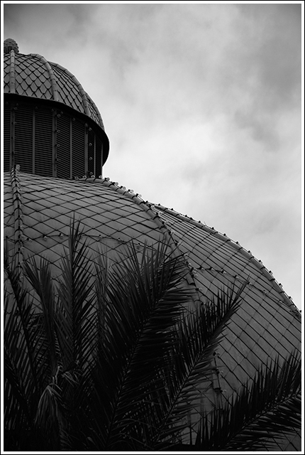
Nice mood. It's a bit dark and the palms in the front are distracting. As always, that's just my opinion.
Wonder how this might look against a blue sky in colour. |
|
| Photographer found comment helpful. |
|
|
02/24/2006 01:54:42 PM |
| Nice tones on this one. I like how the sky is not overdramatically done, it looks very natural which I like. The one thing I don't care for is the palm fronds. The building looks very cool and they kind of detract from it. Maybe shooting from a different angle? Good job |
|
| Photographer found comment helpful. |
|
|
02/24/2006 01:51:40 PM |
| I'd like to see this in color. I'm not a big fan of b&w unless it's something like a really old building of some sort, or people. I like the way it's cropped though. |
|
| Photographer found comment helpful. |
Home -
Challenges -
Community -
League -
Photos -
Cameras -
Lenses -
Learn -
Help -
Terms of Use -
Privacy -
Top ^
DPChallenge, and website content and design, Copyright © 2001-2025 Challenging Technologies, LLC.
All digital photo copyrights belong to the photographers and may not be used without permission.
Current Server Time: 04/23/2025 08:51:46 AM EDT.