| Author | Thread |
|
|
03/13/2006 07:55:37 AM |
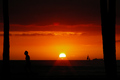
Greetings from the Critique Club!
Aesthetic: I think its a great scene which needs bit more attention for better results.
Technical: Seems to be well exposed but the focus seems to be on softer side.
Challenge: Closer to challenge and the title passes the idea well :)
Conclusion: Overall this is average composition. It could have turned out much better if rule-of-thirds was followed. A little bit more of back-lighting would have given good silhoutte effect to bushes. Though I'm not too sure, but maybe 6x4 crop would have taken away extra negative space from top and bottom of frame.
I did not voted for this challenge but would have given around 5 to this one which is in-line with overall score. Considering this is just your second submission, you surely have potential :) Good-luck for future submissions!
I'm by no means expert in area of photography. My comments are purely based on my limited understanding of technology and art behind digital photography. Apart from doing detailed evaluation of your submission, my intent is to learn different styles of photography by critically evaluating selective submissions. If you've got any questions about this critique, please feel free to contact me via email or PM.
Wish you a great day!
-Tej |
|
 Photographer found comment helpful. Photographer found comment helpful. |
Comments Made During the Challenge  |
|
|
03/07/2006 05:19:06 PM |
|
| Photographer found comment helpful. |
|
|
03/06/2006 08:54:16 PM |
| Nice placement although I think the crop is too tight. 7 |
|
| Photographer found comment helpful. |
|
|
03/05/2006 05:34:40 PM |
| i really like your depiction here, way to be creative! :) |
|
| Photographer found comment helpful. |
|
|
03/05/2006 04:10:44 PM |
| I really like this one and can relate to it. |
|
| Photographer found comment helpful. |
|
|
03/04/2006 08:59:36 AM |
| gr8 pic,love the red skyline |
|
| Photographer found comment helpful. |
|
|
03/03/2006 12:53:10 PM |
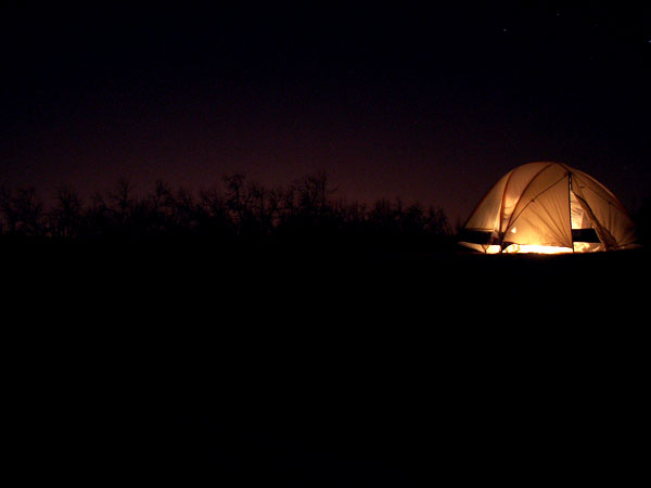
This did give me a warm glow.
Only problem I had was that my eye wanted to either bring the tent down a touch to center or push it farther up offcenter. It was too close or not close enough for me. |
|
| Photographer found comment helpful. |
|
|
03/02/2006 07:08:10 PM |
|
| Photographer found comment helpful. |
|
|
03/01/2006 07:20:48 AM |
|
| Photographer found comment helpful. |
Home -
Challenges -
Community -
League -
Photos -
Cameras -
Lenses -
Learn -
Help -
Terms of Use -
Privacy -
Top ^
DPChallenge, and website content and design, Copyright © 2001-2025 Challenging Technologies, LLC.
All digital photo copyrights belong to the photographers and may not be used without permission.
Current Server Time: 03/14/2025 09:31:20 AM EDT.