| Author | Thread |
|
|
03/13/2006 11:35:22 AM |
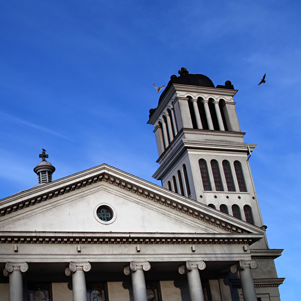
| It is indeed a very interesting photo, sharp and detailed contrast. I think that may have hurt the vote, the contrast is not natural. It looks more like an oil painting or an Adobe Illustrator art work than a photo. It has a very computer assisted graphic look found in many of the new movies and animated features. It is good but as others have said tha angles are interesting and combined with the graphoc look I think it just was down voted. Good try .. be proud of your work, there are a lot of jerks here so be thick skinned and don't give up. |
|
 Photographer found comment helpful. Photographer found comment helpful. |
|
|
03/13/2006 11:29:17 AM |
I gave it a 4. My reasoning was probably that you cut a building in half and I probably wouldn't have found the whole building that interesting to begin with. That opinion might be more personal than on technical merits, where it's fine but it's straight from the hip.
edit: I also don't see where the square crop lends itself or ehnances the subject.
Message edited by author 2006-05-01 07:40:56. |
|
| Photographer found comment helpful. |
|
|
03/13/2006 11:06:23 AM |
My take on this pic is as follows(speaking only for myself) and offering an opinion on what might improve your score for next time.
My guess is that a more distorted view of the tower would give more of an abstract/architectural feel. I'm thinking of one where the tower shoots up and accross the picture in a diagonal line contrasting nicely with the triangle of blue sky.
Or, A more traditional orientation with less leaning would be the alternative.
I think this picture is stuck between these two perspectives leaving the viewer confused(visually).
Something else at play here might also be the feeling that the type of building(old, traditional, halls of justice type), needs a more traditional representation. Most of us would like to think that our judicial systems are solid and straightforward.
Hope this helps.
mark |
|
| Photographer found comment helpful. |
Comments Made During the Challenge  |
|
|
03/11/2006 04:26:21 PM |
|
| Photographer found comment helpful. |
|
|
03/09/2006 08:24:24 PM |
| This shot doesn't fit well in the square. Maybe if the angle of the shot were more verticle it woule be better. |
|
| Photographer found comment helpful. |
|
|
03/09/2006 03:21:02 PM |
| Try and keep verticals vertical, although colour and texture are very pleasing |
|
| Photographer found comment helpful. |
|
|
03/08/2006 04:16:42 PM |
| Beautiful blue sky. I don't care for the tilt in this. |
|
| Photographer found comment helpful. |
|
|
03/07/2006 04:14:19 PM |
| I really like the colors and exposure, but the distortion is a little distracting. I think that you might make up for that if you could shoot from more of an angle, or rotate your image some. Very nice details though - especially the birds. |
|
| Photographer found comment helpful. |
|
|
03/06/2006 04:38:09 PM |
| Don't look now but the tower is leaning! |
|
| Photographer found comment helpful. |
|
|
03/06/2006 02:55:40 PM |
| Things seems to be falling over. Birds are very small, so does not add to the picture imo. All imho obviously. Good luck! |
|
| Photographer found comment helpful. |
|
|
03/06/2006 02:42:40 AM |
| lovely colour, perspective and composition |
|
| Photographer found comment helpful. |
Home -
Challenges -
Community -
League -
Photos -
Cameras -
Lenses -
Learn -
Help -
Terms of Use -
Privacy -
Top ^
DPChallenge, and website content and design, Copyright © 2001-2025 Challenging Technologies, LLC.
All digital photo copyrights belong to the photographers and may not be used without permission.
Current Server Time: 03/17/2025 09:50:50 PM EDT.