| Author | Thread |
Comments Made During the Challenge  |
|
|
03/21/2006 06:46:49 PM |
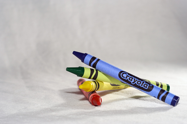
| The Crayola's always seem to make a good picture;-) |
|
|
|
03/20/2006 03:57:26 PM |
| Simple is beautiful. Nice background, nice lighting, good composition. Send this to Crayola! |
|
|
|
03/20/2006 03:32:12 PM |
| The color is fantastic. I love how the blue is still bright and bold with out washing out the other colors even though its the center of focus. |
|
|
|
03/19/2006 05:40:56 PM |
| Great capture of colors and form! |
|
|
|
03/19/2006 11:41:37 AM |
| I really like this composition and the lighting is great. The only thing I would change is the background to a crisper white without texture. |
|
|
|
03/18/2006 10:39:46 PM |
|
|
|
03/17/2006 07:27:45 PM |
| i like the photo, the colors are vibrant and the shot is very well taken. ive seen many crayon photos and i tend to only vote high on unique ideas. but this is the best crayon and the most appealing color shot that i have seen so far 9 |
|
|
|
03/17/2006 02:37:25 PM |
| well-built composition. The shadows of the crayons could have been more brought out, I think, but still a great photo. |
|
|
|
03/17/2006 10:19:50 AM |
| crop inmore too much dead space |
|
|
|
03/17/2006 12:44:27 AM |
|
|
|
03/16/2006 05:26:41 PM |
|
|
|
03/16/2006 04:09:11 PM |
|
|
|
03/16/2006 04:00:51 PM |
| nice and simple - I do like the colors, the focus and lighting are pretty good :) |
|
 Photographer found comment helpful. Photographer found comment helpful. |
|
|
03/16/2006 01:31:03 AM |
| This would have been better with a high key setup I think. Not bad tho. |
|
| Photographer found comment helpful. |
|
|
03/15/2006 08:25:07 PM |
| Nice composition. I think this will do well, especially as the competition isn't that great. What could make this better? I think the curve of the background is too abrupt, it would have been nice for it to be less noticable. The texture of the paper/cloth in the forebround is distracting. I'm no pro on the subject, but I guess you would have to elevate your subject to get rid of this. The hard shadows are also distracting. Again, I'm no pro, but I guess you would want to diffuse your lighting. Keep practising and you'll get it. |
|
| Photographer found comment helpful. |
|
|
03/15/2006 05:19:48 PM |
| Not too bad a still-life attempt but light still a bit harsh and it's not overly compelling. Nice and sharp though. |
|
| Photographer found comment helpful. |
|
|
03/15/2006 09:54:19 AM |
| Great idea and great balance. Personally I would like the background to be a little more white. |
|
| Photographer found comment helpful. |
|
|
03/15/2006 07:17:23 AM |
| Clean, simple, good lines, a bit of artistic imput, this is an 8 from me. |
|
| Photographer found comment helpful. |
|
|
03/15/2006 12:28:47 AM |
|
| Photographer found comment helpful. |
|
|
03/15/2006 12:19:54 AM |
| gives me a feeling of being beack in pre-school... |
|
| Photographer found comment helpful. |
Home -
Challenges -
Community -
League -
Photos -
Cameras -
Lenses -
Learn -
Help -
Terms of Use -
Privacy -
Top ^
DPChallenge, and website content and design, Copyright © 2001-2025 Challenging Technologies, LLC.
All digital photo copyrights belong to the photographers and may not be used without permission.
Current Server Time: 03/12/2025 11:57:39 PM EDT.