| Author | Thread |
Comments Made During the Challenge  |
|
|
03/21/2006 11:12:11 PM |
|
 Photographer found comment helpful. Photographer found comment helpful. |
|
|
03/17/2006 06:03:45 PM |
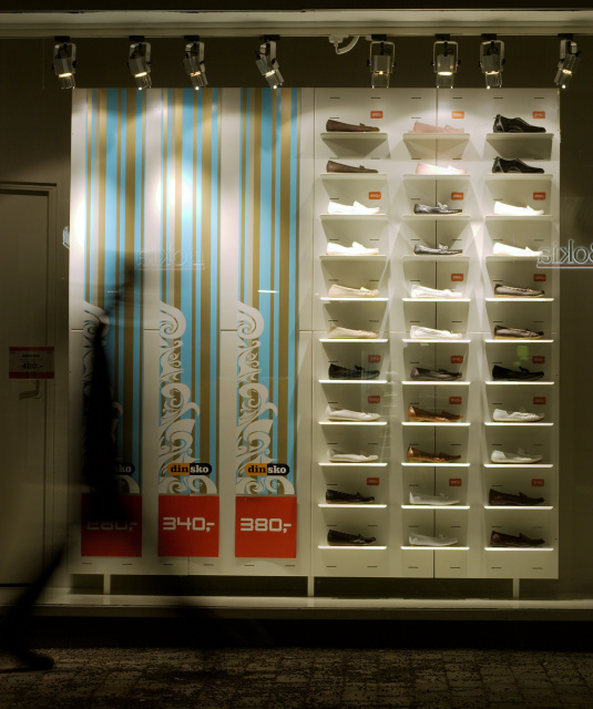
| I really like this one, very artistic and something a bit different. The motion-blurred figure adds just the right amount of life to it and the composition works really well. 9 |
|
| Photographer found comment helpful. |
|
|
03/16/2006 05:43:26 PM |
|
| Photographer found comment helpful. |
|
|
03/16/2006 09:43:15 AM |
| Nice idea, composition, and colors. The shoes are just too small - cropped for larger shoes would be better. |
|
| Photographer found comment helpful. |
|
|
03/16/2006 08:28:43 AM |
|
| Photographer found comment helpful. |
|
|
03/15/2006 05:45:23 PM |
| doesn't spark or hold interest - too dark - too many distractions in the shadows... subject does not catch eye |
|
| Photographer found comment helpful. |
|
|
03/15/2006 10:09:37 AM |
| I don't quite understand the title. I like this because of the blurred figure, the warm quality of the light and the area of bright color in contrast to the overall neutral tones. This isn't the kind of thing that tends to do well in the voting, however. It appeals to me, though. |
|
| Photographer found comment helpful. |
|
|
03/15/2006 09:34:08 AM |
| Awesome...love that streak of a person passing through the composition...well done. |
|
| Photographer found comment helpful. |
|
|
03/15/2006 03:52:20 AM |
| I like the lighting, but I think the composition would be stronger if you cropped a bit tighter around the showcase. Also, the text on the window and the walking figure are distracting |
|
| Photographer found comment helpful. |
Home -
Challenges -
Community -
League -
Photos -
Cameras -
Lenses -
Learn -
Help -
Terms of Use -
Privacy -
Top ^
DPChallenge, and website content and design, Copyright © 2001-2025 Challenging Technologies, LLC.
All digital photo copyrights belong to the photographers and may not be used without permission.
Current Server Time: 12/14/2025 02:01:30 PM EST.