| Author | Thread |
Comments Made During the Challenge  |
|
|
03/21/2006 10:45:31 PM |
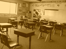
| You are able to have the largest side of your photo measure 640 pixels. You should try to take advantage of that in the furure. A photo this small will never win. |
|
|
|
03/21/2006 10:44:15 PM |
| very clean, agood subject matter... Although, the walls in the back have stuff on them... if that were gone, the title might fit more... but then it might not look as good.. I don't know |
|
|
|
03/21/2006 10:38:43 PM |
bummer this is soo small - you've probably gots tons of comments on that already and probably already know that your largest side can be a 640 max. having said that - it appears to be a pretty good image that meets the challenge a bit better than some others I have seen - so good job on that - can't really make out the quality of the image at this size but the sepia choice looks interesting, seems like there is a slight slant for effect - and I like the title :)
Message edited by author 2006-04-29 09:25:38. |
|
|
|
03/21/2006 07:24:56 PM |
| I think it would be better if it was bigger 8 |
|
|
|
03/21/2006 01:45:27 PM |
| I find it difficult to judge such a small image. |
|
|
|
03/20/2006 08:50:57 PM |
| I know you probably are aware but pic is too small to judge |
|
|
|
03/20/2006 07:29:38 PM |
| Bigger is better in this case.. great shot though |
|
|
|
03/19/2006 07:37:38 PM |
| Photo is too small to properly judge |
|
|
|
03/18/2006 02:37:04 PM |
|
|
|
03/17/2006 07:33:40 PM |
| photo is way too small to see any detail. was this done for a reason? its a great concept but i cant see any detail |
|
|
|
03/17/2006 09:59:40 AM |
| nice picture put the duotone doesnt do it any justice |
|
|
|
03/16/2006 08:43:54 PM |
| This shot would score much better if it were larger. |
|
|
|
03/16/2006 06:22:48 PM |
| Looks like it has potential, but the small size makes it hard to see the detail. |
|
|
|
03/16/2006 11:04:18 AM |
| I'm sure you've gotten this comment already, so here it is again: too small, you should use the whole 640 pixels you have available. |
|
|
|
03/16/2006 10:08:32 AM |
| Sure wish this was a bit bigger. Anyway, seems just a touch overexposed (highlights blown out a bit) and needs a human element in my opinion like a student or teacher. |
|
|
|
03/15/2006 09:47:16 PM |
| This image is too small for me to see anything ;( |
|
|
|
03/15/2006 01:50:40 PM |
| Nice picture but a bit too small. |
|
|
|
03/15/2006 01:34:12 PM |
| Image is too small to see anything, please see Learn > Tutorials > Using Photoshop to Prepare Photos for DPC Challenges |
|
|
|
03/15/2006 12:36:20 PM |
| Just in case you don't know - you can have up to 640 x 640 pixel photographs in challenges and most people will mark you down if you don't enter a larger photo. (you may already be experiencing that). It's a great photo though with a nostalgic feel to it. |
|
|
|
03/15/2006 12:01:54 PM |
| Would look better larger I think |
|
|
|
03/15/2006 10:56:57 AM |
| Why didn't you make this picture bigger? Great photo otherwise. -8 |
|
|
|
03/15/2006 09:59:19 AM |
| This is a great image. However it being so small its hard to tell the detail. I believe this would have done great if it were the standard size for this site. |
|
|
|
03/15/2006 07:28:13 AM |
| Far too small to see any kind of detail, make the most of the 640 crop allowed |
|
|
|
03/15/2006 03:03:12 AM |
| this looks like a really nice shot, i wish that it was a bigger picture though. |
|
|
|
03/15/2006 02:48:55 AM |
| make the photo larger next time....I'm having a hard time seeing what is in the photo |
|
|
|
03/15/2006 01:07:43 AM |
| Too small. Good subject but just damn too small. |
|
Home -
Challenges -
Community -
League -
Photos -
Cameras -
Lenses -
Learn -
Help -
Terms of Use -
Privacy -
Top ^
DPChallenge, and website content and design, Copyright © 2001-2025 Challenging Technologies, LLC.
All digital photo copyrights belong to the photographers and may not be used without permission.
Current Server Time: 03/12/2025 10:41:11 AM EDT.