| Author | Thread |
|
|
03/22/2006 09:55:43 AM |
| Thank you everyone for your comments. As I learn about my new camera, I am also learning good tips from your comments. Thanks! |
|
Comments Made During the Challenge  |
|
|
03/20/2006 04:11:38 PM |
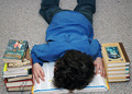
| This is a really cute scene and the composition seems just right to me. If only it were sharper. I can see that it was shot at a slow shutter speed and probably handheld. A tripod can hold the camera steady and prevent blur from camera shake (I use one that can get very low to the ground for shooting children). Bumping up the ISO setting, when possible, can help acheive a faster shutter speed and reduce the motion blur from the subject. |
|
 Photographer found comment helpful. Photographer found comment helpful. |
|
|
03/20/2006 03:56:14 PM |
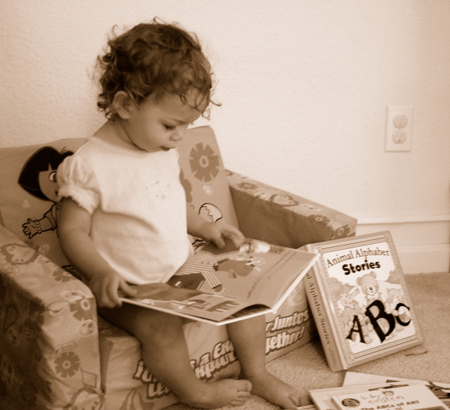
| Nice, sepia is beautiful ... like an old photograph. Wish it could be sharper but that's ok, like i said, it looks like an old photograph. |
|
|
|
03/20/2006 09:21:29 AM |
| Nice image but it needs to be brought into focus. |
|
|
|
03/19/2006 07:38:42 PM |
|
|
|
03/19/2006 06:42:01 AM |
| Nice compostition, shame about the poor focus. |
|
|
|
03/16/2006 11:04:40 AM |
| Would have given this higher if the child had been in focus.. |
|
|
|
03/15/2006 05:23:57 PM |
| Sepia tone doesn't work here because it gives the photo an old feel but that conflicts with the Dora the Explorer chair, which can't be very old. Image looks a bit fuzzy to and very snapshotish. |
|
| Photographer found comment helpful. |
|
|
03/15/2006 02:31:05 PM |
|
|
|
03/15/2006 01:44:55 PM |
| I was going to do this exact same thing but ran out of time... |
|
|
|
03/15/2006 10:04:10 AM |
Use of sepia in this composition works well and you captured your young subject at a moment of discovery and learning. This image captures true education far better than 98% of the images that will score above it.
The biggest defect in this image is focus. Your model should be in tack sharp focus. You can see that your autofocus decided the background should be focused and not your subject since it occupies more space.
Your perspective is not necessarily bad but is "snapshot-like". Taking it from the right up from floor level where you could see the whole face might be worth trying. You can't see the contents of the book from that perspective but you have a different angle and the facial expression is what makes the image. The contents of the book are inconsequential.
You might also consider a tighter crop and cut out as much wall in the background as possible. It adds little to the composition and the wall plug is a major distraction. There is a tendency for photographers to include the entirety of an object, like the book on the right, in the image. But you can achieve a very pleasing effect by including part but not all of an object. Cropping out part of the book would achieve that effect as well as get rid of the wall plug. |
|
| Photographer found comment helpful. |
|
|
03/15/2006 07:14:09 AM |
| The one thing against this image is that it is blurry. Beautiful child and great idea. |
|
| Photographer found comment helpful. |
|
|
03/15/2006 06:51:19 AM |
| Nice idea but not completely in focus |
|
|
|
03/15/2006 12:23:26 AM |
|
Home -
Challenges -
Community -
League -
Photos -
Cameras -
Lenses -
Learn -
Help -
Terms of Use -
Privacy -
Top ^
DPChallenge, and website content and design, Copyright © 2001-2025 Challenging Technologies, LLC.
All digital photo copyrights belong to the photographers and may not be used without permission.
Current Server Time: 03/12/2025 03:23:39 AM EDT.