| Author | Thread |
|
|
04/06/2006 09:49:27 AM |
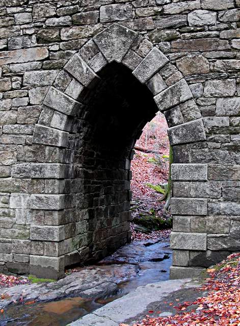
| I like the image... very nice textures. I agree with some of the comments that it might look better in black and white, maybe some dodging a burning to give it a "grittier" look, but then again, that's just my opinion and may not be the "look" you were going for. |
|
 Photographer found comment helpful. Photographer found comment helpful. |
|
|
03/14/2006 09:03:05 PM |
| I like the shot. I would like to see the whole picture toned down a bit. Leave just a hint of color so that the leaves don't overpower the arch. |
|
| Photographer found comment helpful. |
|
|
03/14/2006 08:35:24 PM |
| this is a great shot...but I really think b/w will look better. Just my 2 cents |
|
| Photographer found comment helpful. |
|
|
03/14/2006 08:33:29 PM |
| I can see what you're going for and it does work. The leaves look just a little too pinkish (may be my monitor). Would like to see this with the graffiti and maybe all black and white. I do like the composition and the detail on the stone |
|
| Photographer found comment helpful. |
|
|
03/14/2006 08:02:00 PM |
| Lovely arch. Would like to see this in black and white too. IMHO I might try to crop down the bottom of the shot a little. I like the water under the arch, but that muddy spot up front detract a little bit for me. |
|
| Photographer found comment helpful. |
Home -
Challenges -
Community -
League -
Photos -
Cameras -
Lenses -
Learn -
Help -
Terms of Use -
Privacy -
Top ^
DPChallenge, and website content and design, Copyright © 2001-2025 Challenging Technologies, LLC.
All digital photo copyrights belong to the photographers and may not be used without permission.
Current Server Time: 04/22/2025 10:27:53 PM EDT.