| Author | Thread |
Comments Made During the Challenge  |
|
|
03/20/2006 03:56:21 AM |
| Seems a little too bright and harsh, but good concept. |
|
 Photographer found comment helpful. Photographer found comment helpful. |
|
|
03/19/2006 07:37:36 PM |
| The idea is good, it's just too over exposed and has too much contrast. |
|
| Photographer found comment helpful. |
|
|
03/18/2006 01:31:05 PM |
| great photo. the contrast adds a lot to it as well. |
|
|
|
03/17/2006 09:56:41 AM |
| its too bright in the top left corner |
|
|
|
03/16/2006 05:40:13 PM |
| Funny. Thats what i'm working on. |
|
|
|
03/16/2006 10:52:13 AM |
| Nice composition, it looks over saturated to me though. |
|
| Photographer found comment helpful. |
|
|
03/16/2006 06:44:22 AM |
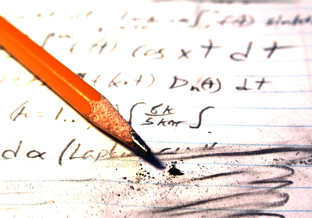
| I hate math. This captures that well. |
|
| Photographer found comment helpful. |
|
|
03/15/2006 01:40:50 PM |
| Doesn't look quite like the quadratic formula to me, but I really like the idea! |
|
|
|
03/15/2006 11:31:46 AM |
| Highlights too blown out at top of page, but composition is pretty good. |
|
| Photographer found comment helpful. |
|
|
03/15/2006 10:27:12 AM |
| the quadratic formula? looks more like some calc |
|
|
|
03/15/2006 06:44:56 AM |
| Not too keen on the lighting, nice idea though. |
|
Home -
Challenges -
Community -
League -
Photos -
Cameras -
Lenses -
Learn -
Help -
Terms of Use -
Privacy -
Top ^
DPChallenge, and website content and design, Copyright © 2001-2025 Challenging Technologies, LLC.
All digital photo copyrights belong to the photographers and may not be used without permission.
Current Server Time: 03/12/2025 02:25:53 PM EDT.