| Author | Thread |
|
|
04/06/2006 04:25:24 PM |
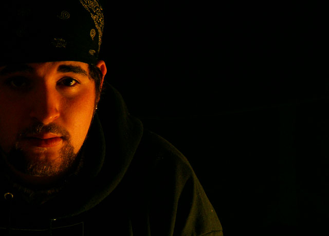
| This is a beautiful shot, it really should have placed higher. There is a lot of emotion conveyed by those eyes. As far as the "dead space" goes, I think it very much improves the picture and makes it unique. |
|
 Photographer found comment helpful. Photographer found comment helpful. |
Comments Made During the Challenge  |
|
|
03/26/2006 08:46:24 PM |
| Good luck dude! A good photo, but I think it would help a bit if it was more original. |
|
| Photographer found comment helpful. |
|
|
03/25/2006 10:28:14 AM |
|
| Photographer found comment helpful. |
|
|
03/23/2006 03:03:18 PM |
| Think the dead space to right of his shoulder is wasted and throws composition off. Otherwise a nice shot. |
|
| Photographer found comment helpful. |
|
|
03/22/2006 08:25:25 PM |
| The tone on his face is a bit too red |
|
| Photographer found comment helpful. |
|
|
03/22/2006 06:53:59 PM |
| I'd desat the yellows and reds so his skin doesn't look that color. Nice use of negative space. Good focus with low light. |
|
| Photographer found comment helpful. |
|
|
03/22/2006 12:39:54 PM |
|
| Photographer found comment helpful. |
Home -
Challenges -
Community -
League -
Photos -
Cameras -
Lenses -
Learn -
Help -
Terms of Use -
Privacy -
Top ^
DPChallenge, and website content and design, Copyright © 2001-2025 Challenging Technologies, LLC.
All digital photo copyrights belong to the photographers and may not be used without permission.
Current Server Time: 03/14/2025 09:30:43 AM EDT.