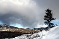
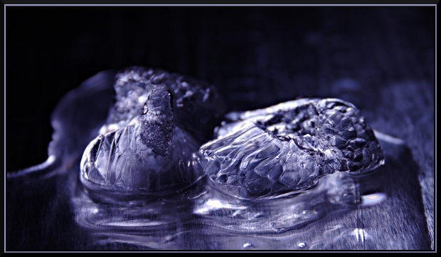
I gave this a 6. I recall having to study this shot quite a while (a minute, maybe 2 (long time in voting)), trying to decipher what it was. The frozen forms within the ice (cubes?), which look like bubbles perhaps, didn't make this instantly recognizable as ice. I liked the concept, but the clarity was not sharp enough for what appeared to be a macro, or macro attempt with this subject (no expert on lenses, but doesn't appear you've used a macro lens here). I didn't mind the toning but not sure it enhanced the subject(s) as well as leaving them natural may have. The angle/perspective was fairly good but perhaps sharper may have given this an edge. Compositionally, less background and more foreground, giving more balance and showcasing your 'textures' here and more frame 'height', would have likely made this better in my opinion. The 'base' looks like wood grain to me and would never have guessed tin foil, so again, perhaps leaving the natural coloring may have allowed the color and texture of the foil to complement your subject(s): ice and water.
In response to your request for a comment: I rated this image above average (and at 5.6, it did indeed receive an overall above average score). I really enjoy the abstract feel of this photo. I think you captured the picture at the right moment of melt ;) and the positioning of the two half-cubes in the frame is dead-on, in my opinion. The detail is outstanding. The nice little intricate lines in the cube, which are sometimes angled downwardly from what looks like wood grain in the surface, are captivating. The soft puddly liquid offsets this detail well. I like the large dark area above. The melting ice seems to be taking on interesting shapes, and I like the subtlety of the two little bubbles in the foreground. I don't want to detract from others' experience of viewing this fine image, but I see chickens, wooden shoes, forks, bouquets :). I'm sure a Rorschach test was not your original intent, but this great abstract makes one want to look close. I'm not a purple fan, but your choice for the duotone is the right one. This is a great image.
I can't improve on such an image, except to suggest an even higher resolution and, if it were possible, even more detail.
You may be interested in a conversation about "candy coating" on another thread. It might apply here. ;) Congrats, this is a wonderful abstract example in my view.