| Author | Thread |
Comments Made During the Challenge  |
|
|
08/04/2003 12:34:00 AM |
| A little wider on the crop would have made this work better for me 5 |
|
|
|
08/02/2003 07:14:35 PM |
| Bottom of the picture is not balanced |
|
|
|
08/02/2003 07:11:59 AM |
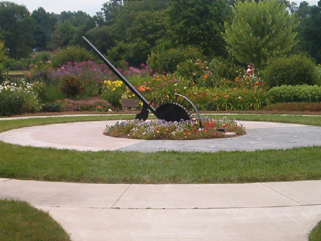
| this whole photo seems a bit washed out. the composition has the sundial centred, which *could* be okay, but the rest of the strong features are not quite centred, which throws the whole thing off imo. |
|
|
|
08/01/2003 04:03:17 PM |
| A slight more contrast would have helped, I think.. |
|
|
|
07/31/2003 05:16:39 PM |
| The image is a little muddy looking, I'm guessing from a high compression. I think a different angle might be better also. The subject is right in the middle of the frame, and isn't altogether that interesting. |
|
|
|
07/31/2003 11:55:03 AM |
| Focus seems very soft.. subject matter uninspiring.. |
|
|
|
07/31/2003 11:23:01 AM |
| too much of the pavement in front |
|
|
|
07/30/2003 09:09:06 AM |
| I like the composition of the photo. I wish the person was not in the background. Also if you could have backed up a foot or two so that the entire cement circle were in, or to have incorporated the cement circles more - I think that would have helped the picture. The color is lovely. |
|
Home -
Challenges -
Community -
League -
Photos -
Cameras -
Lenses -
Learn -
Help -
Terms of Use -
Privacy -
Top ^
DPChallenge, and website content and design, Copyright © 2001-2025 Challenging Technologies, LLC.
All digital photo copyrights belong to the photographers and may not be used without permission.
Current Server Time: 03/12/2025 02:18:11 AM EDT.