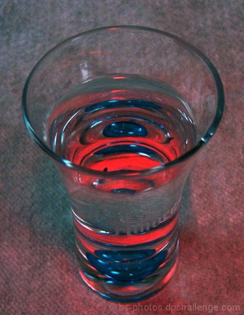
Had a different picture submitted at first but decided to try to play around with getting splash shots... I didn't have any luck with those, but thought this looked kinda neat, I had read the link about getting good shots from a p&s, & thought i'd try covering up the flash like they said, I only used my hand to cover it & got this weird red that come into the picture. Debated on how it'd get voted, but I like it so I figured I'd try it.
Edit:
Contrast
Color Balance
Crop
Resize
Hopefully it'll have a decent result, voting ends on my birthday!!
Comments are always welcomed & appreciated!
Statistics
Place: 286 out of 287 Avg (all users): 4.0324 Avg (commenters): 4.0000 Avg (participants): 3.9528 Avg (non-participants): 4.1392 Views since voting: 823 Views during voting: 259 Votes: 185 Comments: 9 Favorites: 0
This is your entry in the 'Water II' challenge. Definitely fits the challenge, looks like water to me :-) Good to hear you experimenting with classic type shots (water drops). Although some people are always going on about the whole 'cliche' thing, IMO, it is a great learning tool to work on these types of traditional shots. Ask a lot of the great photographers around, and I'm sure most will tell you they worked on all kinds of 'cliched' shots on the path to wear they are! Water drop shots are definitely a challenge, I believe there may be a good tutorial or two here on the site about them. Anyways, on with your shot here.
I like your idea here. A simple, yet to the point approach. You've nicely kept the scene neat and free of any distracting elements. I think the colors you got actually add a lot to this particular shot. From your description, I can't exactly say what they are from for sure. Probably a reflection of something. You'd have to take a good look at the area you shot in, look for anything of those colors that could of showed up. Maybe there is a mirror in that room? Could even be the clothes that you had on at that time. Be that as it may, the colors are good in this case :-) I think the composition is ok for what you were going for here, filling the frame, and as I said you kept it clean and uncluttered.
I think I can offer up a few suggestions here to try in the future for shots of this nature. For one thing, the focus does seem a little off, as some commenters pointed out. A few things could help here. For one, if you are not already using one, a tripod is a must. I see you took this on your table, so even a 'mini' tripod would work. Or even a box, or books, etc., any solid surface to set the camera on, and use the timer. Some people use beanbags or similar things so they can adjust the angle of the camera. Another thing, is make sure you are not too close to the subject, so close that you are beyond the camera's minimum focus distance. You can also apply sharpening in processing, all depending on what specific software you use. Of course, you still need to start with an in focus pic :-) If your program has USM (unsharp mask), this is what most folks use for sharpening. Gives a lot of control.
Next, let's talk about background. Looks like you've got there either a piece of carpet, or tablecloth of some kind? It's good that you're going for something basically neutral in color, but do you see how the texture of it shows a lot? If not contributing directly to the concept, this tends to be a distraction. And some parts of the glass start to kind of get lost. If you look at a lot of the shots of this nature, you'll see they usually have a plain black or white background. You don't have to have pro quality muslin or anything, there are a lot of readily available things that you can use. Old sheets (make sure you iron out the wrinkles), poster board, foam board. Pieces of material from those sewing places (a lot of people like velvet or similar). Just look around some, you can find lots of things. I have some pieces of white and black foam board, I got at an arts and crafts place for less than a buck a piece.
Lastly, we'll discuss lighting. Your lighting here is even, no harsh hot spots or shadows, but a little flat. Better lighting will also help get a faster shutter speed, which can also help with sharpness. Good lighting can add drama, give a more vivid and lively presentation, or help set a mood. It is good that you diffused the onboard flash, but probably a lot better off to avoid the flash altogether whenever possible. With some simple lighting, you will have a lot more control over the shoot. Onboard flash can sometimes be good for fill light, but p&s flashes are notoriously horrible normally :-) Again, a nice set of alien bees, and pro strobes and softboxes and stuff would be awesome to have, but a little resourcefulness can get positive results. Actually, a lot of people will say that natural light is the best light, if you can understand how to use it. Take advantage of windows and well lit rooms, watch what times of day affect the lighting in the room. You can also use regular lamps and such. Some people have shop lights, like you can get at any dept or hardware store. I have some clamp lights (they look like a metal reflector with a light bulb socket, about 5 bucks each). Experiment with different distances, and angles and such. Just watch your white balance. You can also use those same poster boards and foam boards and stuff as reflectors for fill light.
I think some attention to little details like this could of boosted your score considerably. I think you're on the right path. You've got some nice shots in your profile. I like your 'landscape II' shot, and the one of the old house. Oh, and I really like the quote in your bio. :-) Work on some technical stuff, I'm sure you'll have some good scores in your future. I look forward to seeing more of your stuff.
If you have any questions or comments or anything, please feel free to contact me.
Not sure about the angle you took this at - it seems to create an odd perspective. I'm also finding the background rather distracting, made more so I think by the red lighting.
yes, it's something different, but it's also slightly out of focus and not really all that exciting.
a plain background (black or white) may have improved it.
I rated this picture below average because I don't feel the light, composition or focus is particularly well thought out. I enjoy the interesting effect you have created within the glass however (the red).
Different background and better lighting, focus on the front rim of the glass and this would be amazingm i love that the background shows through the middle of the glass.