First...let's make sure I did not spell the title "Primrose Setzler"....hmmmm....Ok.
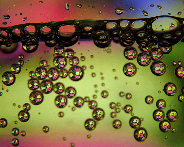
I displayed an image of a bed of primroses on my computer monitor. Then I took a bottle of sparkling water (that is what is on the lable), Clear Choice Black Cherry (Great stuff, the recycle bin clearly proves it) and set it on a couple/three books in front of the monitor. The camera was mounted on a table top tripod and had a 10x close up filter on. The shooting mode was standard, not macro: the image was focused by moving the camera or, at times the bottle forward and back (I think Fritz Kirbic gave me that idea in a forum here....thanks Fritz!). I also shot using a faster shutter at f/ 3.0 of about 1/50 second or switched to f/ 8.0 using a slower shutter speed, like 1/8 to 1/10. This was shot at f/ 3.0 and 1/32 second. The white balance, which seems odd but works the best for me when shooting in the ambient light of the computer monitor, was cloudy.
I shot this idea in 6 different sessions over the past week using different backgrounds and changing from a one liter seltzer bottle to a two liter bottle of Diet Sprite and then back to the seltzer. This is from the first session. The bottle was initially un-opened and chilled. I unscrewed the cap to let air in to make the bubbles and then closed it again to take the pictures.
Post: Layer adjustments for levels, brightness/contrast and hue/saturation. Sharpen. Cloned/healed some lines that were either trails of some of the carbonation bubbles or scratches on the bottle.and one, of all things, water stain near the top of the image. Crop...this was cropped at about 95% of a full size 1.25:1 aspect ratio. Resize. Sharpen.
Statistics
Place: 135 out of 287 Avg (all users): 5.4731 Avg (commenters): 6.0000 Avg (participants): 5.3909 Avg (non-participants): 5.5921 Views since voting: 954 Views during voting: 277 Votes: 186 Comments: 5 Favorites: 0
Your image has a lot of interest, both in the subject matter and composition. The bubbles reflect the flowers well (though not perfectly), and the resulting background colour bokeh is very pleasant. There is a satisfying distribution of water drops across the image, with tiny and small drops spaced evenly amongst larger ones, and in-focus and out-of-focus elements nicely balanced. Overall, a nice effect.
The dark line of water is very heavy, and weights the image toward the top in a way that, for me, detracts slightly. If this were dodged to lessen the effect, I think this may have helped. I'm also distracted by the droplets above the water line; their uneven shapes, compared to the more formal round shapes below, and their uneven distribution, also compared to below, is not a benefit. However, some may argue that this is a contrasting element of the photo that is pleasing. The glass at the top is not spotless, or too sharp, or otherwise not as effective as the appearance of the glass below. Softening, in my opinion, would have helped this area in general.
Aside from these points, some of which are merely a matter of taste, the image is effective. Congrats!