| Author | Thread |
|
|
04/06/2006 11:15:29 AM |
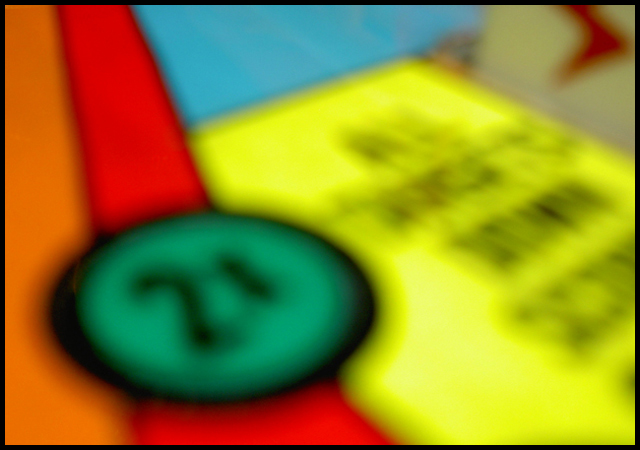
Well thanks to everyone for the comments. I knew it would probably not get the best rating. As the week went on I thought about it and think it would have done better as an abstract "art" picutre and probably isn't best suited for a contest in photography.
The other thing that didn't help is the thumbnail view. It looks better the larger the picture is.
On to the next challenge... |
|
|
|
04/05/2006 10:37:56 PM |
Originally posted by xianart:
my god this is stunningly annoying. i take it it's supposed to be? i love the colours though. very brave. |
just to let you know, i gave you a 6 on this. and i agree, it would be beter on a large scale. it does kind of do my eyes in on the monitor...
i do apologise for sounding rather rude in my first comment. i was trying to be flip and humourous. didn't work, did it? i did mean the very brave bit though.
Message edited by author 2006-04-05 22:40:15. |
|
 Photographer found comment helpful. Photographer found comment helpful. |
|
|
04/05/2006 03:17:25 AM |
| I think this may work well poster-sized on a wall where there's more space to let it... integrate? The blur would work well then, but it's just a little overpowering at this close range. |
|
| Photographer found comment helpful. |
|
|
04/05/2006 01:34:22 AM |
Hmmm,,,I guess I'm not really surprised, but a little disappointed this shot ended up so low in the ranking. I wouldn't expect it to be embraced enough to end up at the top of the field, but it bums me out to see it soooo un-embraced :-) (if you know what I'm trying to mean)
Don't get me wrong here, I'm certainly not trying to put down the voters as a whole, I firmly believe in people's opinions, and that everyone's opinion is a valid one. It just seems like sometimes, there is this lemming like hold on the masses to quickly pass by anything not following the mainstream. Or maybe I'm crazy and a hopeless romantic with an almost rebellious quirky taste for the unorthodox :-P
I still say that upon a deeper study of this shot, it seems to me that the fact that it is not 'in focus' actually contributes to the shot, and what it is about, the colors, the forms, the feel of it as a whole. I applaud you for being brave and confident enough to display this peice for the scrutiny of the masses. Don't be discouraged, most of my stuff is only 'liked' by little pockets of people, and that actually quite pleases me.
Anyways, I like the shot. Well done, and thank-you :-) |
|
| Photographer found comment helpful. |
Comments Made During the Challenge  |
|
|
04/04/2006 11:38:35 PM |
| I see what you where going for but I think its way too out of focus a bit harsh on the eyes... maybe if the yellow was not there |
|
|
|
04/04/2006 10:25:48 PM |
| my god this is stunningly annoying. i take it it's supposed to be? i love the colours though. very brave. |
|
|
|
04/04/2006 09:36:38 PM |
| What focus? This is visually unsettling to look at. |
|
|
|
04/02/2006 07:26:04 AM |
| it's juts a blurry picture |
|
|
|
04/01/2006 09:56:48 PM |
|
|
|
04/01/2006 09:25:41 AM |
| I have herd many people said it is difficult to get a good photo with everything out of focus, but I think this is one of the exceptions. I like it. Hope it is doing well. 7 |
|
| Photographer found comment helpful. |
|
|
03/31/2006 10:56:23 PM |
| The idea is to make it abstract by taking it more closely than we normally look, not to make it too out of focus to recognise. Nice collours, but... |
|
| Photographer found comment helpful. |
|
|
03/31/2006 10:02:18 PM |
| I guess I like more focus even if this an abstract. |
|
|
|
03/31/2006 08:30:10 PM |
| Strong primary colors. Dynamic composition. But it is hard for me to vote this very highly with nothing at all in focus. |
|
| Photographer found comment helpful. |
|
|
03/31/2006 10:47:15 AM |
| Nice colours, but too much blurred. |
|
|
|
03/30/2006 08:11:55 PM |
| I understand that this photo is deliberately out of focus but gee it is hard on the eyes! |
|
|
|
03/30/2006 12:31:20 AM |
| I find this a very interesting image. I really hope and pray that voters are not slamming this for the blur :-) It looks blatantly obvious to me that it is purposeful, and I think works well with what it seems like you're going for here. The shot is about the colors, and the shapes and forms. Very cool. I'm wondering if perhaps the composition might be a little stronger though without the area in the upper right corner? Maybe just a slightly tighter framing. Maybe not? Something to try perhaps. Also, there seems to be a kind of whitish splotch on the yellow area just to the right of the main green circle. Maybe something from processing, or perhaps a touch of glare in the photo? It is very minor though. Yep, a nice concept and cool shot. I like it :-) |
|
| Photographer found comment helpful. |
|
|
03/29/2006 02:18:12 PM |
| I'm not voting in this challenge, but I congratulate you to your courage to enter an OOF picture on DPC. Good luck. |
|
| Photographer found comment helpful. |
|
|
03/29/2006 02:05:54 PM |
| Uh, there isn't any focus? |
|
|
|
03/29/2006 01:47:07 PM |
|
|
|
03/29/2006 01:07:35 PM |
| love the brightness of color, but honestly the focus hurts my eyes! |
|
| Photographer found comment helpful. |
Home -
Challenges -
Community -
League -
Photos -
Cameras -
Lenses -
Learn -
Help -
Terms of Use -
Privacy -
Top ^
DPChallenge, and website content and design, Copyright © 2001-2025 Challenging Technologies, LLC.
All digital photo copyrights belong to the photographers and may not be used without permission.
Current Server Time: 03/12/2025 07:28:45 AM EDT.