| Author | Thread |
|
|
08/04/2009 07:49:09 PM |
Greetings from the Critique Club! Apparently it took us a little while to get to this...so I apologize for that. (hey, only a little over 3 years...)
I have seen your photography level grow by leaps and bounds since this was taken, but will still offer my opinion on this none the less. It is also rather ironic since I clicked the "take a shot at something older" in the CC que and the first one that pops up is by someone I just 10 minutes ago discussed drop shots with in a current thread!
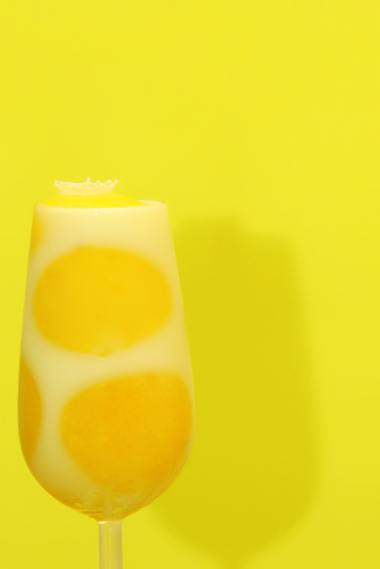
As for the image, I think what really hurt this was the fact that the main attraction of the image (the crown from the splash) is small and also tough to distinguish from the background. I love the idea of the egg yolks to add interest and colour to the milk. I think a different background colour which contrasted with the subject...to make the subject stand out more would have helped this shot a lot. (Even though this challenge was "yellow" I think it still would have me the challenge even with a black background) |
|
 Photographer found comment helpful. Photographer found comment helpful. |
Comments Made During the Challenge  |
|
|
04/07/2006 06:04:02 PM |
| did at first not see the splash. So the detail is missing and missing sharpness that would draw attention to it |
|
| Photographer found comment helpful. |
|
|
04/05/2006 06:35:55 PM |
| yum...i think we could all use that right now! |
|
| Photographer found comment helpful. |
|
|
04/04/2006 11:06:56 AM |
| Yummy! That looks delicious! Is that a splace on the top? It's hard to tell, almost missed it. Lovely colors, the shadow is just muted enough not to distract but to add and the splash is a nice touch. But there seems to be a yellow bubble or something on the top that bugs me because the splash is more white while the area it's coming from is yellow and raised. It keeps my attention, that's for sure! ;) An 8 |
|
| Photographer found comment helpful. |
|
|
04/03/2006 03:44:12 PM |
| i think if the subject were further from the background (less shadow) this would be more fun. |
|
| Photographer found comment helpful. |
|
|
04/03/2006 02:56:16 PM |
| The background didn't need to be yellow here, would have been just as good on white to get a better contrast. This way the glass blends in with the background. |
|
| Photographer found comment helpful. |
Home -
Challenges -
Community -
League -
Photos -
Cameras -
Lenses -
Learn -
Help -
Terms of Use -
Privacy -
Top ^
DPChallenge, and website content and design, Copyright © 2001-2025 Challenging Technologies, LLC.
All digital photo copyrights belong to the photographers and may not be used without permission.
Current Server Time: 03/10/2025 06:16:05 PM EDT.