| Author | Thread |
Comments Made During the Challenge  |
|
|
04/09/2006 03:52:36 AM |
|
 Photographer found comment helpful. Photographer found comment helpful. |
|
|
04/07/2006 12:55:16 AM |
| Crisp and clean - like the muted tones. |
|
| Photographer found comment helpful. |
|
|
04/06/2006 08:19:25 PM |
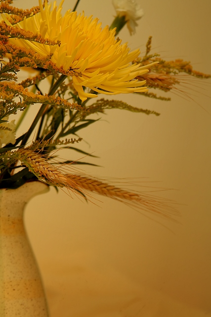
| Very nice composition. I like the subject choice. There is a lot of interest with the different floral elements as well as the nice curves on the vase/pitcher. Lighting seems a little too low, though it is nice. It has a very soothing, calm factor going for it. That said, I think it is helping the subject blend a bit too much into the background. This may be a case where there is too much yellow in too similar of shades. The focus is great on many of the floral elements and that helps draw the image from the background, but I find it still melds into the background more than I think is beneficial for the image as a whole. I do however like the gradient effect the background is showing with the darker gold at the bottom and lightening up towards the top a bit. 5. |
|
| Photographer found comment helpful. |
|
|
04/03/2006 02:38:42 AM |
| Beautiful. Due to the crop, this seems like it would fit well into a triptych. Love it. |
|
| Photographer found comment helpful. |
Home -
Challenges -
Community -
League -
Photos -
Cameras -
Lenses -
Learn -
Help -
Terms of Use -
Privacy -
Top ^
DPChallenge, and website content and design, Copyright © 2001-2025 Challenging Technologies, LLC.
All digital photo copyrights belong to the photographers and may not be used without permission.
Current Server Time: 04/28/2025 07:01:19 AM EDT.