| Author | Thread |
Comments Made During the Challenge  |
|
|
08/10/2003 03:34:13 PM |
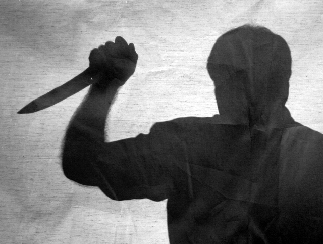
I would have liked to have seen the water coming down from the shower to enhance this photo. Nice silhouette, though.
|
|
 Photographer found comment helpful. Photographer found comment helpful. |
|
|
08/07/2003 10:13:49 AM |
| Look out! He's behind you! Get out of the shower . . . um . . . or from behind that sheet! |
|
| Photographer found comment helpful. |
|
|
08/06/2003 12:38:41 AM |
| good idea, challenge met, good composition |
|
| Photographer found comment helpful. |
|
|
08/05/2003 12:18:26 PM |
| I really liked this.. then saw the other two which are a little better detailed and closer to the original movie.. still gave this a 7 tho |
|
| Photographer found comment helpful. |
|
|
08/05/2003 09:03:22 AM |
My voting criteria for this challenge are:
1. Did you capture a scene from the movie (as the challenge brief states) or did you enter a picture and fit a title to it.
2. How close a rendition is your image to the movie.
3. How does the image stand up in its own right.
In this case:
1. Unless you're some sort of nutter I assume you shot this specifically.
2. Unfortunately I don't recall Anthony Perkins attacking though a sheet.
3. The lighting and exposure is good, may be a little too bright in the centre. The creases in the cloth are intrusive.
Overall a good picture which meets the challenge. 5 |
|
| Photographer found comment helpful. |
|
|
08/04/2003 09:42:23 AM |
| Nice shot... he looks like he is about to strike, so in my opinion the knife should be higher. Shame about the baggy top, the silhouette would have worked better with a closer fitting shirt. Compositionally this doesn't quite work for me, perhaps it needs more negative space to the left. 7 |
|
| Photographer found comment helpful. |
|
|
08/04/2003 05:11:42 AM |
this is a good idea... - and a good model ; )
Maybe the backdrop you used was not ironed enough?
I like it, but I would like to see this idea having more dept, this is silouette is maybe to 2-dimensional, like a drawing?
Good luck in the challange. |
|
| Photographer found comment helpful. |
Home -
Challenges -
Community -
League -
Photos -
Cameras -
Lenses -
Learn -
Help -
Terms of Use -
Privacy -
Top ^
DPChallenge, and website content and design, Copyright © 2001-2025 Challenging Technologies, LLC.
All digital photo copyrights belong to the photographers and may not be used without permission.
Current Server Time: 03/12/2025 06:35:13 PM EDT.