| Author | Thread |
Comments Made During the Challenge  |
|
|
04/18/2006 12:13:30 PM |
|
|
|
04/18/2006 12:05:50 PM |
|
|
|
04/16/2006 12:10:07 PM |
Fits challenge=5
Color/lighting=0
DOF/focus=0
Wow factor/uniqueness=0
Attractiveness=1
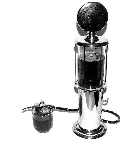
cool object. I feel the lighting at the top could have probably been a little better so that more of that was visable, the darks seem to be too dark (if that's possible). Also, maybe cropped it a little different to avoid cutting off the top, hose and bottom with the border. If more of the bottom and maybe hose section had been cropped it would probably be fine but the little bit makes it appear that you could careless or just didn't take the time. I feel the top really needs the entire part in it. |
|
|
|
04/13/2006 10:28:36 AM |
| It would have been nice if you could have pulled it away from the background a little more to reduce/eliminate that harsh shadow. The scratches/reflections on the top pieces are a bit of a distraction too. 5 |
|
|
|
04/13/2006 05:27:44 AM |
| I think this would be better if the logo on the top part was fully visible. |
|
Home -
Challenges -
Community -
League -
Photos -
Cameras -
Lenses -
Learn -
Help -
Terms of Use -
Privacy -
Top ^
DPChallenge, and website content and design, Copyright © 2001-2025 Challenging Technologies, LLC.
All digital photo copyrights belong to the photographers and may not be used without permission.
Current Server Time: 03/12/2025 01:25:59 AM EDT.