| Author | Thread |
Comments Made During the Challenge  |
|
|
04/18/2006 12:43:47 PM |
| I would have liked to see more contrast. |
|
 Photographer found comment helpful. Photographer found comment helpful. |
|
|
04/12/2006 07:14:39 PM |
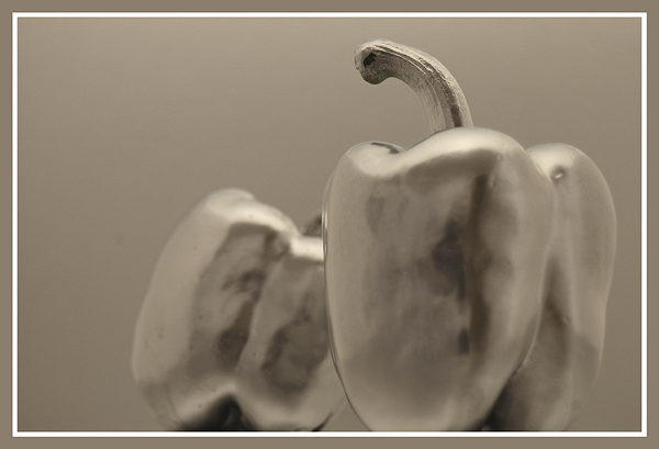
Don't get the numbers? hmmm, green no. 1, red no. 2, yellow no. 3 .....
It would been better if they shined a bit more. |
|
| Photographer found comment helpful. |
|
|
04/12/2006 04:23:06 PM |
| Wow, now this is an interesting entry! Very nice effects and careful processing. The shine is captivating. I feel like I'd like to see this sharper, but maybe the softness is part of the intention here. Everything goes together well, colors, frame, and composition, like a piece of music. Nice. |
|
| Photographer found comment helpful. |
|
|
04/12/2006 01:47:16 PM |
| Nice composition. Overall image seems pretty dull for chrome, I'd prefer brighter levels and more contrast. |
|
| Photographer found comment helpful. |
|
|
04/12/2006 10:34:03 AM |
| don't care for the white inset border |
|
| Photographer found comment helpful. |
Home -
Challenges -
Community -
League -
Photos -
Cameras -
Lenses -
Learn -
Help -
Terms of Use -
Privacy -
Top ^
DPChallenge, and website content and design, Copyright © 2001-2025 Challenging Technologies, LLC.
All digital photo copyrights belong to the photographers and may not be used without permission.
Current Server Time: 03/13/2025 01:34:31 AM EDT.