| Author | Thread |
Comments Made During the Challenge  |
|
|
08/12/2003 03:49:30 PM |
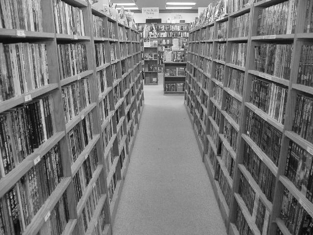
I can clearly see 2 books on the second shelf down from the right that are not at right angles. Very poor. [1]
Just kidding. This lacks a bit of contrast though - it's quite light. [6] |
|
|
|
08/11/2003 11:33:02 AM |
| Very good idea, I love books! I feel like the image could have been a little sharper, bringing out the right angles more. |
|
|
|
08/09/2003 12:57:21 PM |
| a sharpen image effect and more light wil be good |
|
|
|
08/09/2003 12:36:24 AM |
great perspective
interest=1 |
|
|
|
08/08/2003 05:05:18 AM |
| Not enough contrast. Picture looks too bright. Yeah, flourscent light plays havoc with digital cameras. Maybe set the ISO setting a little bit lower. You probably get some good shadows. I think the composition would look nicer if you stood closer to one side of the shelves and shot along it. Picture looks busy. |
|
 Photographer found comment helpful. Photographer found comment helpful. |
|
|
08/08/2003 01:14:46 AM |
| Wonderful perspective here,and a marvelous idea. Just a bit more contrast would add some umph to this nice shot. |
|
| Photographer found comment helpful. |
|
|
08/07/2003 01:13:50 PM |
| i was thinking of doing a library shot, too, but went with something different... yours looks great, i like the blur and all... 8 |
|
|
|
08/07/2003 12:19:18 PM |
| i think this would be stronger with more contrast. everything seems to be in the midtone range and blends together. |
|
| Photographer found comment helpful. |
|
|
08/07/2003 12:10:42 PM |
| Good leading lines. You have good angles but I think more contrast would have really brought out the photo. Overall good shot! |
|
| Photographer found comment helpful. |
|
|
08/06/2003 05:32:28 PM |
| Those right angles really do stop the eye and cause you to focus right there. |
|
Home -
Challenges -
Community -
League -
Photos -
Cameras -
Lenses -
Learn -
Help -
Terms of Use -
Privacy -
Top ^
DPChallenge, and website content and design, Copyright © 2001-2025 Challenging Technologies, LLC.
All digital photo copyrights belong to the photographers and may not be used without permission.
Current Server Time: 03/12/2025 01:39:54 AM EDT.