| Author | Thread |
|
|
04/28/2006 01:39:49 PM |
Hello from the Critique Club
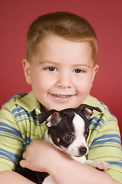
First impression is that this is a very cute portrait! His smile looks very genuine, not forced, you can tell by his eyes. It gives me the feeling that he is happy because he is holding his best friend in the world. I especially like how he is holding the dog, almost like a hug. They both seem happy together.
The dog's pose is excellent. He is not looking at the camera, so he doesn't compete for the attention of your eye. Yet he is very attentive with his ears up and his gaze fixed on something. I like the position of his paw, it adds to the feeling that he is returning the hug.
You received several comments that this has an "old" feeling to it. I would have to agree with that. I don't know if it was intentional or not, but I think it helped this portrait stand out from the others. I think it is the combination of the colors, the style of his shirt, and his hair cut that give it this feeling.
You also received some comments about the focus. This is probably the one flaw in this shot. The dog is slightly sharper than the boy. This pulls the attention back onto the dog. If the pose was not so good, this would have been a lot more detrimental to this shot. Closing your aperture one or two stops would have helped with this (I have this problem too!).
The lighting is excellent. The subject is far enough away from the background that he doesn't leave any shadows. The lights are positioned so that there is a slight shadow on the side of his face, which really gives the shot a feeling of depth.
Overall this is a great portrait! This would be a shot that I have framed and sent to members of my family. |
|
 Photographer found comment helpful. Photographer found comment helpful. |
Comments Made During the Challenge  |
|
|
04/23/2006 11:42:11 PM |
| Ireally like the little boy and dog together but I really dont care for the red background with his hair. Speaking as a parent... The overall picture is great tho. |
|
| Photographer found comment helpful. |
|
|
04/23/2006 09:36:19 AM |
| This image looks like an olden style colour cast. It's terrific! Would of liked a bit more sharpness on the childs face though! Well done! |
|
| Photographer found comment helpful. |
|
|
04/21/2006 06:35:33 AM |
| Very sweet, very natural. I might suggest a tiny bit of contrast boost to make those great colors pop a bit more. :) |
|
| Photographer found comment helpful. |
|
|
04/20/2006 11:18:54 PM |
| This image reminds me of the old advertisements for that hamburger joint that isn't around anymore... I think it's overprocessed as he, and the cute doggy, look like plastic. |
|
| Photographer found comment helpful. |
|
|
04/20/2006 07:09:58 PM |
| a very sweet pic, reminiscent of the 1950s! however, the focus is poor, or too much NI. it realy looks like the dog's eye is infocus, not the boy's. graet colours. |
|
| Photographer found comment helpful. |
|
|
04/19/2006 06:01:07 AM |
is the puppy the main subject, or the boy hugging it?
your focus seem to have fallen on the puppy. If I'm a customer, I'd be mad! :p |
|
| Photographer found comment helpful. |
|
|
04/18/2006 09:01:17 PM |
| This is cool! It looks like a vintage photo. |
|
| Photographer found comment helpful. |
|
|
04/18/2006 08:13:05 PM |
this photo looks like a classic 80's portrait photo.
kicks ass. |
|
| Photographer found comment helpful. |
|
|
04/18/2006 04:16:22 PM |
| I think that the fstop was too small here. the dog seems in focus but not the boy. Use at least 8 or 11 to get a better DOF. |
|
| Photographer found comment helpful. |
|
|
04/18/2006 09:02:43 AM |
| This looks like a colored portrait from maybe 40-50 years ago... the colors and everything makes this look very old, like from 1950-60. That is not bad, but I just had to mention it. Good photo. |
|
| Photographer found comment helpful. |
|
|
04/17/2006 08:44:40 PM |
| Can't get more wholesome than that... |
|
| Photographer found comment helpful. |
|
|
04/17/2006 11:56:15 AM |
| Nice shot, but seems a bit soft on the focus. |
|
| Photographer found comment helpful. |
|
|
04/17/2006 09:49:18 AM |
| Looks like it came out of a 1950 book. Nice job. |
|
| Photographer found comment helpful. |
Home -
Challenges -
Community -
League -
Photos -
Cameras -
Lenses -
Learn -
Help -
Terms of Use -
Privacy -
Top ^
DPChallenge, and website content and design, Copyright © 2001-2025 Challenging Technologies, LLC.
All digital photo copyrights belong to the photographers and may not be used without permission.
Current Server Time: 04/28/2025 06:38:41 AM EDT.